
Enrich Our Society by Co-creating Values
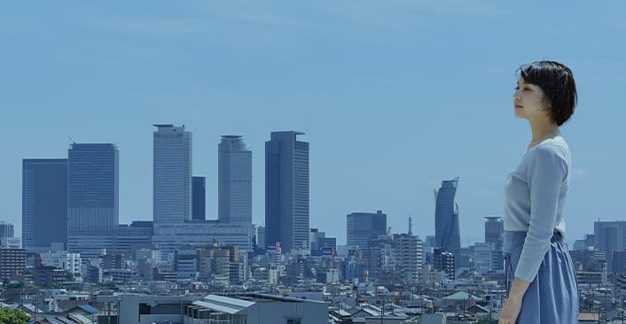
REJ is a comprehensive real estate company based in Nagoya, Aichi prefecture. They have run a real estate business, urban development, and land development for 20 years, and they have also expanded their business overseas. They have got involved in various businesses since their establishment, and they have been seeking a way to contribute to the local community, and to the people living in local areas.
Challenges
Depicting a Brand Strategy After the Business Integration
There were three companies, CIP that have grown their business as a general real estate developer, REJ Development that have mainly involved in urban development and have expanded their business to various fields not only real estate business, and REJ Investment. Since they have integrated their operations, they needed to redefine their new brand’s vision. As the environment around the real estate business had been changing, it was an urgent need for REJ to strengthen their corporate brand.
Solutions
Integrating and Developing Culture
It was not so easy for the three companies with different projects and culture to be integrated and have the shared identity although they have involved in the same category of business; the real estate. We had discussed for 2 years about what would be the ideal way to be a new brand with Mr. Watano, the CEO of the integrated company, REJ. During the long-term discussion, we found various ways to step forward and finally noticed that making a contribution to Nagoya, Aichi prefecture where Mr. Watano’s hometown and also the company’s establishment place was the most important mission for the new brand. The project team decided their vision to contribute to the local community in Nagoya. As for BOEL Inc, we were in charge of various branding design for the new brand of the company; such as strategy building, naming, designing corporate logo mark, developing various communication tools, and making website.
Results
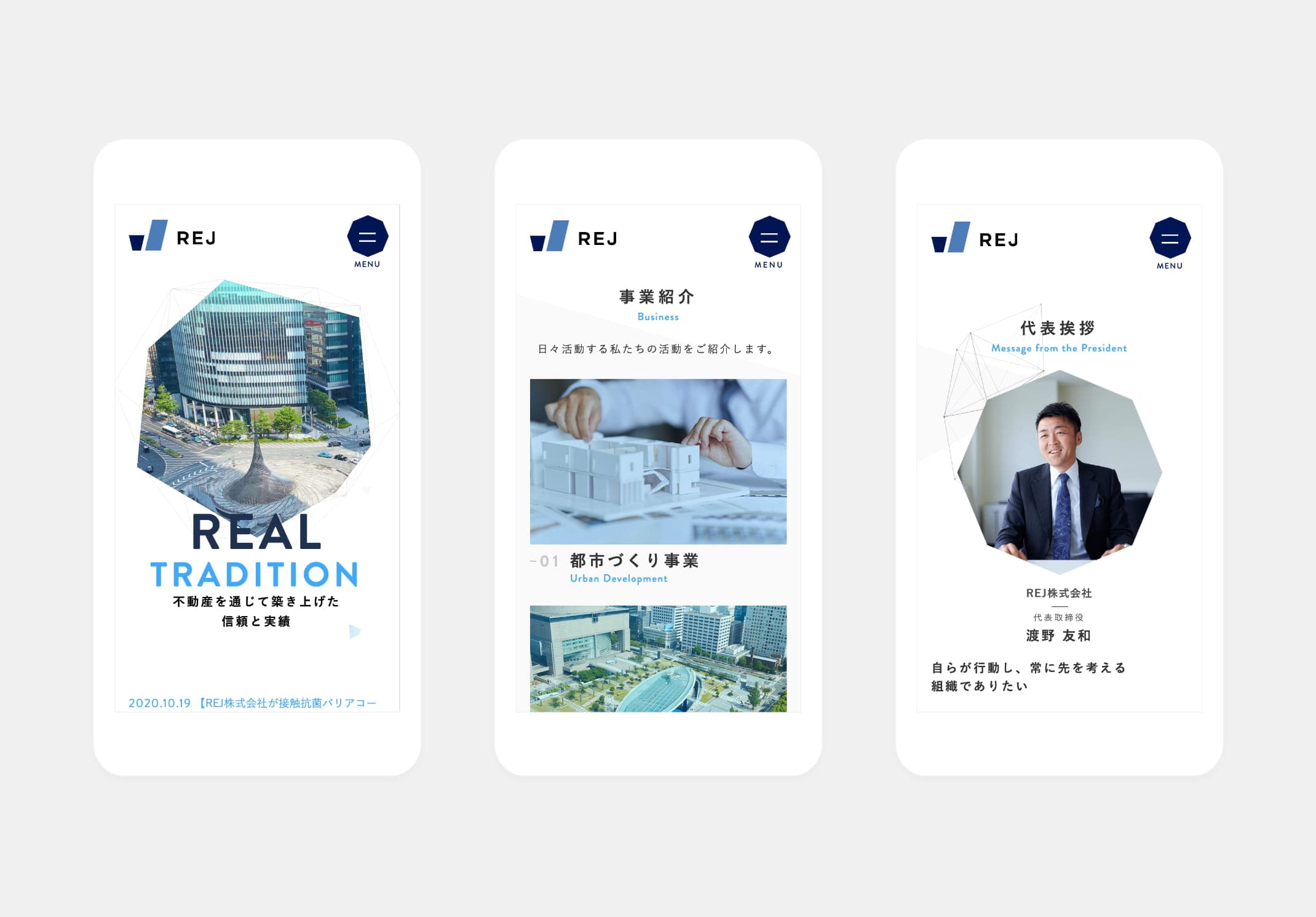
The Design Enhancing Synergies
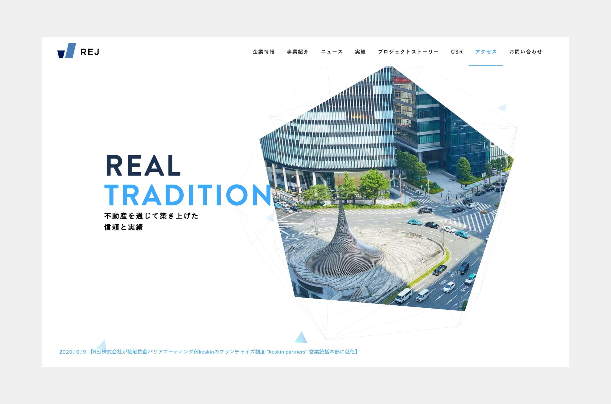
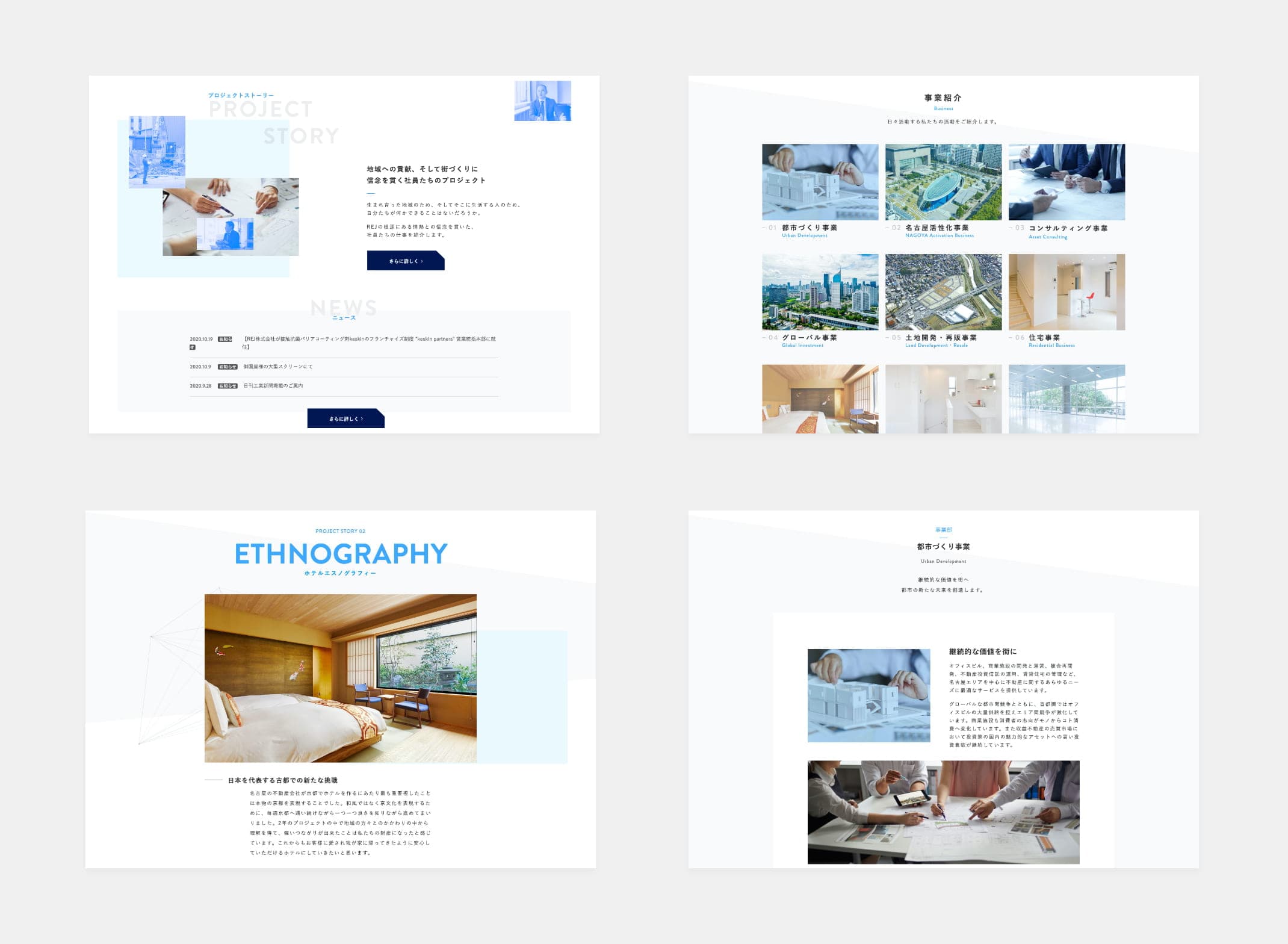
We adopted the simple and strong design for the new corporate logo mark in order to express REJ’s attitude to face the difficulties. A slanting line stands for their business evolution around Nagoya, and all over Japan. The stable rectangles look like an alphabet J represent REJ’s corporate philosophy since their foundation, and they symbolize their strong willingness to support local areas. This brand’s logo mark which is also similar to both J and V, is a symbol of their prosperous coexistence, and it expresses their idea that the customers and the stakeholders should be in a Win-Win situation. As for the website, we used WebGL in order to make interactive website so that it can embody the innovative image of REJ. We also tried to describe their attitude to challenge regardless of their business genre in visual design.
Logo
Symbol
Type
faces
Color
Schemes
RGB / 255 255 255
CMYK / 0 0 0 0
HEX #ffffff
RGB / 62 168 252
CMYK / 67 25 0 0
HEX #3EA8FC
RGB / 30 49 79
CMYK / 94 86 54 27
HEX #1E314F


NEXT
COLLECTON