From “Performance-Driven Housing” to a Brand Chosen Through Empathy
A project that redefined the value of a regional homebuilder through lifestyle-centered brand experiences
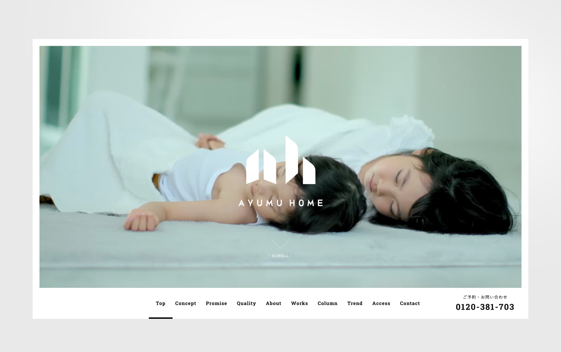
Ayumu Home is a regional homebuilder based in Gunma, Japan, specializing in custom-built homes.
For many years, the housing industry had focused heavily on functional value such as insulation performance, airtightness, and earthquake resistance. At the same time, however, the values people sought in a home were beginning to change.
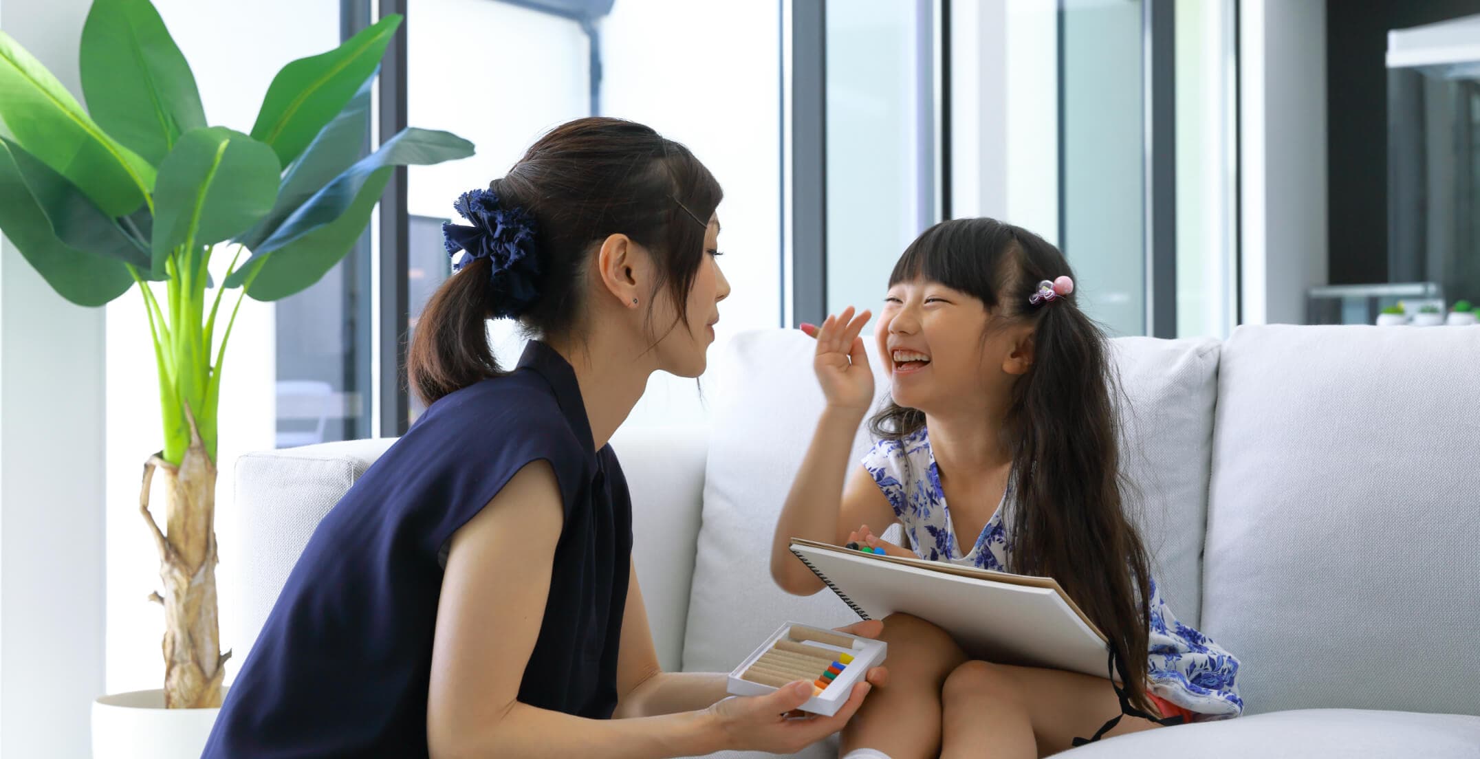
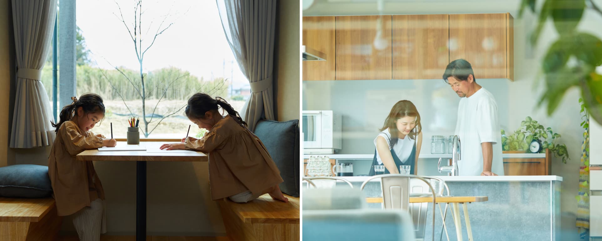
Rather than simply wanting a “high-performance house,” people were increasingly looking for richer lifestyle experiences — how they wanted to live, what kind of time they wanted to spend, and what kind of future they wanted to build with their families.
Through brand strategy, workshops with core members, and ongoing creative direction, BOEL has continuously supported Ayumu Home’s brand development. This project redefined the company not simply as a homebuilder, but as a brand that walks alongside people’s lives and futures.
The project also included talk sessions involving not only management, but also carpenters, architects, and partner companies. Together, they explored what kind of lifestyle values would be needed in the future and collaboratively shaped the next vision of the brand.
Context
Being “high-performance” alone was no longer enough to stay chosen
The housing industry had continued to compete primarily through functional value, including insulation and airtightness performance. However, as these standards became more common across the industry, high performance alone was becoming less effective as a differentiator.
At the same time, consumer expectations were changing. Instead of comparing only specifications and equipment, people began placing greater importance on whether a home could support a lifestyle that felt authentic, comfortable, and emotionally fulfilling over the long term.
Despite this shift, many housing companies still relied heavily on communications centered around performance and specifications, making it difficult for people to imagine what kind of life could actually be lived in those homes.
Regional builders were also facing increasing competition in pricing and customer acquisition, while struggling to clearly articulate why customers should choose them in the first place.
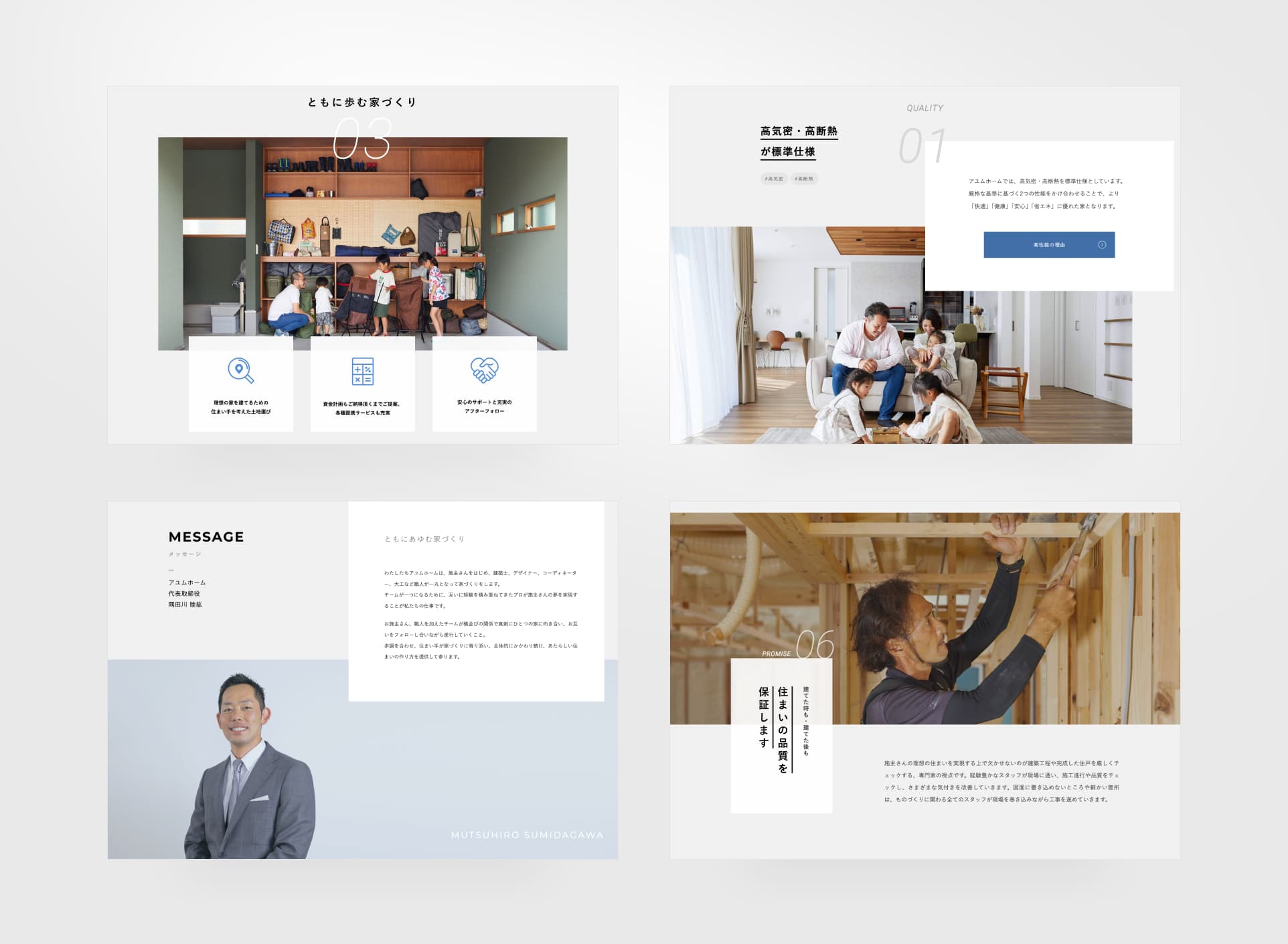
At its core, Ayumu Home had always valued more than simply building houses. The company believed in creating lifestyles together with its customers. However, that philosophy was difficult to fully communicate through performance metrics and project portfolios alone.
The project therefore needed to reorganize not only the company’s functional strengths, but also the deeper values and philosophy behind how it approached people’s lives.
Approach
Redesigning a brand experience centered around people’s lives
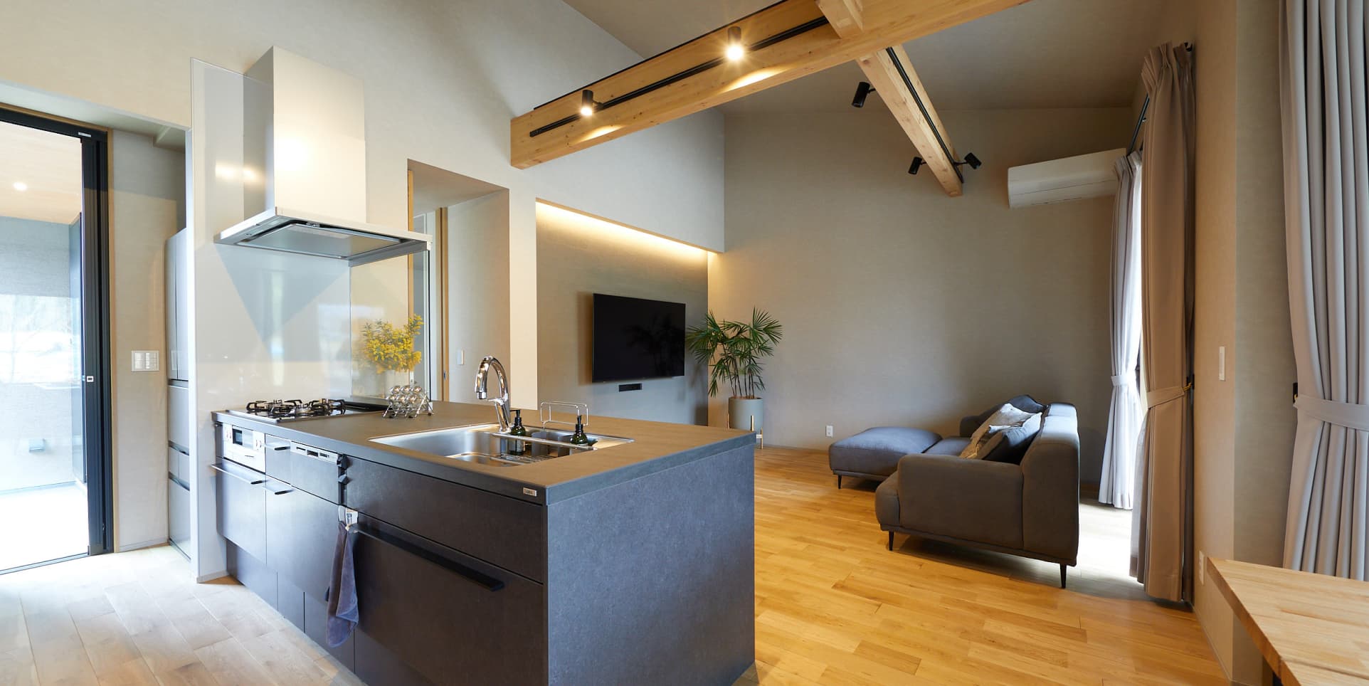
This project repositioned Ayumu Home not simply as a housing company, but as a brand that supports people’s lives over time.
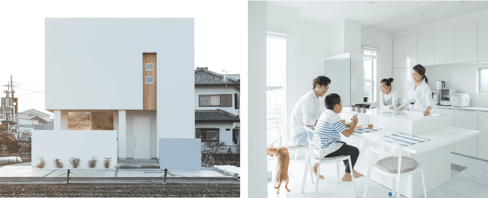
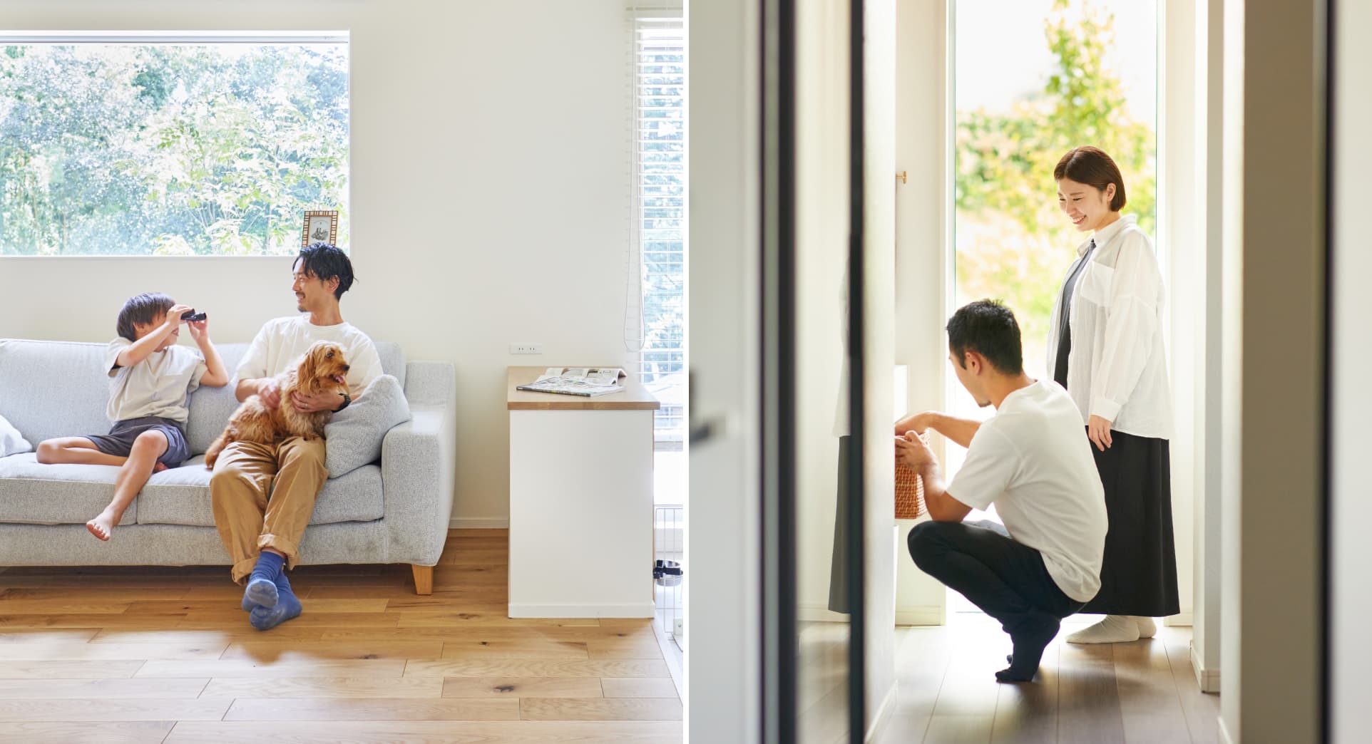
Rather than focusing only on technical performance such as insulation and airtightness, the brand communication was designed to help people naturally imagine the moments, relationships, and everyday experiences that could unfold within the home.
The project also included talk sessions and symposiums involving management, craftspeople, architects, and partner companies. Together, they explored both the values that should never change and the evolving lifestyle expectations of future generations.
Through this collaborative process, the project restructured the entire brand experience around a simple but important question: not just “What kind of house do people want?” but “How do people want to live?”
The project also clarified the brand’s philosophy and value standards, helping the entire organization develop a shared understanding of what makes Ayumu Home unique.
Based on the belief that a brand is built not through advertising alone, but through accumulated human relationships, the project also worked to foster a brand community in which builders, craftspeople, and homeowners collectively shape value together.
Outcome
A home-buying experience centered around empathy and shared values
Through these efforts, Ayumu Home evolved beyond being simply a regional construction company and became recognized as a brand that co-creates the value of living with its customers.
People are now able to choose homes not only by comparing performance and price, but also by understanding the company’s values, the people involved in the building process, and the kind of lifestyle the brand represents.
The workshops also helped align the organization internally, enabling management, craftspeople, and partner companies to share a unified understanding of what truly matters in homebuilding.
The project demonstrated a new direction for regional homebuilders — not simply selling houses, but continuing to support people’s lives over time.
As a result, the project became more than a corporate rebrand. It became an initiative to rethink how regional brands should evolve alongside changing social values and lifestyles.
This project was born from the belief that the goal is not simply to sell houses, but to create environments where people can live more authentically as themselves.
By looking beyond performance and price and reexamining human relationships and the richness of everyday living, the project redefined the role a regional homebuilder can play in people’s lives.
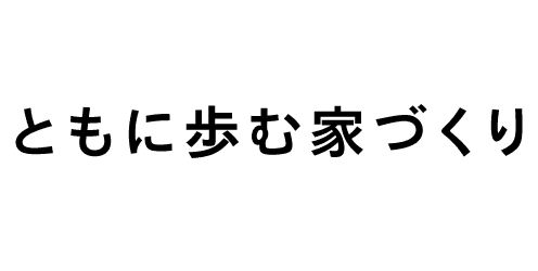
Tagline
Logo
Symbol
Type
faces
Color
Schemes
RGB / 255 255 255
CMYK / 0 0 0 0
HEX #ffffff
RGB / 241 241 241
CMYK / 7 5 5 0
HEX #F1F1F1
RGB / 66 111 167
CMYK / 79 56 18 0
HEX #426FA7


NEXT
CONSTELLA