TECH
Vol.30

A.K.
CSS3のキーフレームでつくるアニメーション
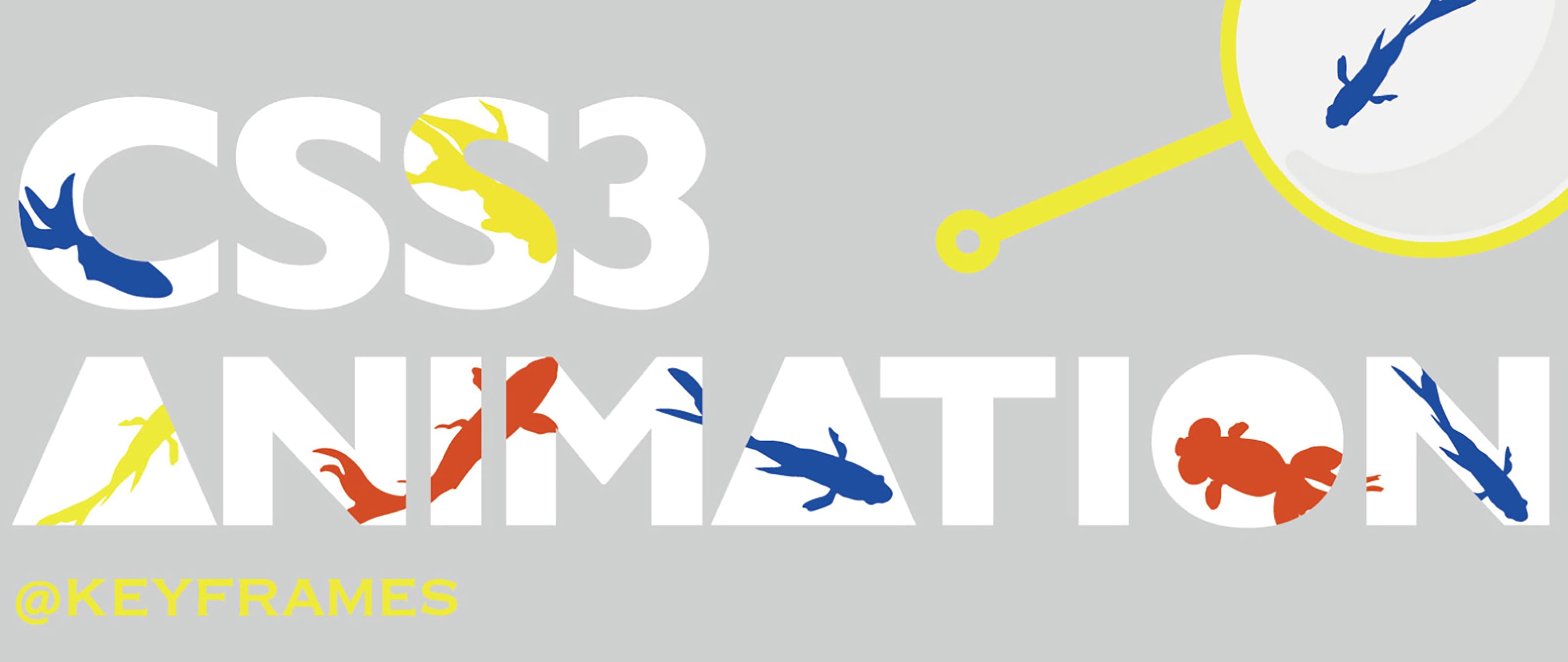
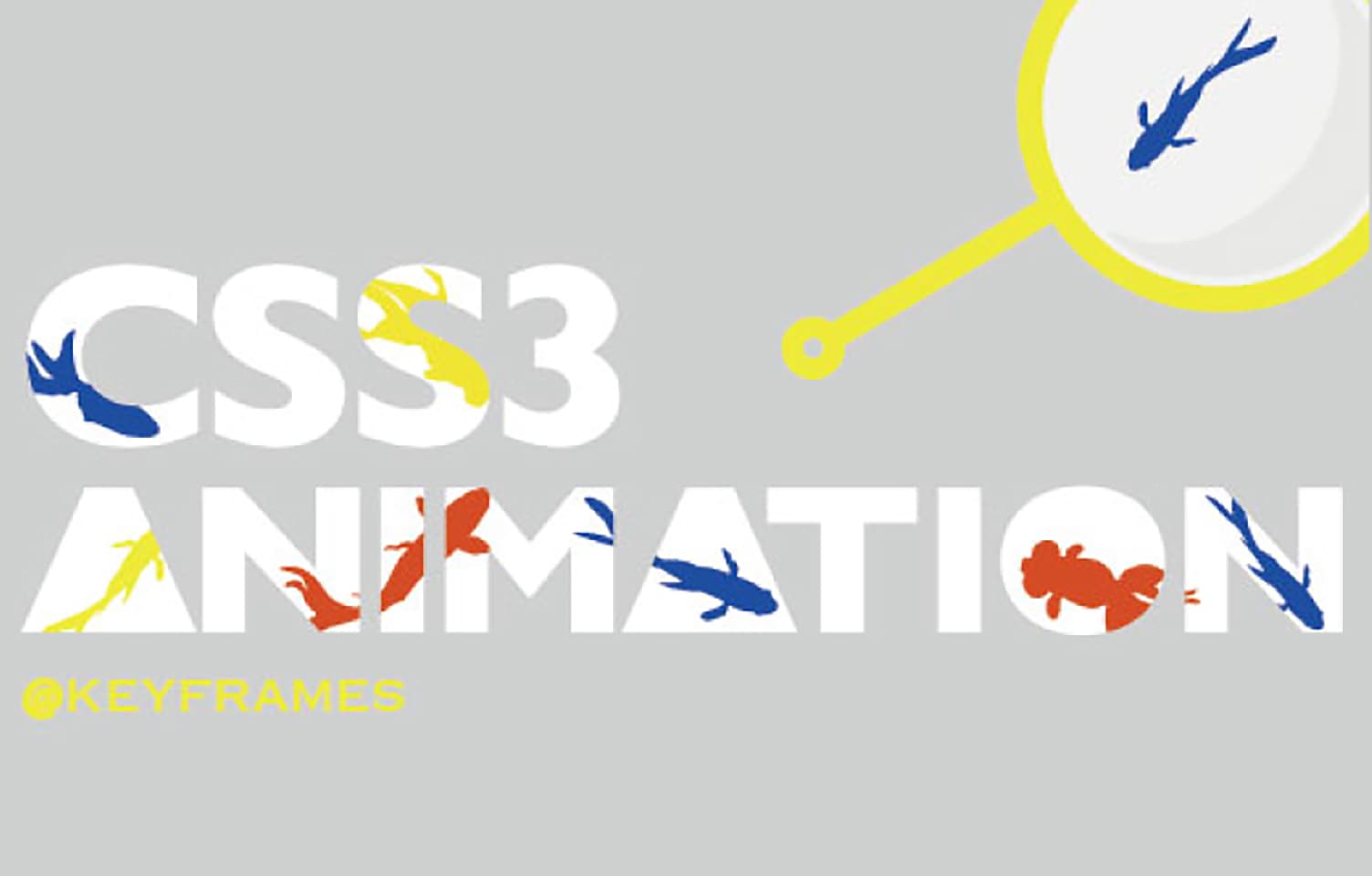
@keyframesって何?
@keyframesとは
@keyframesとは、CSSアニメーションの中でキーフレームと呼ばれる任意のポイントで
スタイルを指定することにより、複雑なアニメーションが可能になります。
具体的にどんなことができるのかは、後ほど実例とともに見ていきましょう。
対応ブラウザ
- IE(10〜)
- Firefox
- Opera
- Chrome
- Safari
-webkit-や-moz-、-ms-などのベンダープレフィックスは忘れずにつけておきましょう。
プロパティ一覧
◯ animation-name
アニメーションを定義する名前を指定します。
ー 例 ー
animation-name: test1;
◯ animation-duration
一回のアニメーションにかかる時間を指定します。
ー 例 ー
animation-duration: 6s;
◯ animation-timing-function
アニメーションするときの変化の方法を指定します。
ー 例 ー
animation-timing-function: ease-in;
◯ animation-delay
アニメーションが始まるまでの遅延時間を指定します。
ー 例 ー
animation-delay: 3s;
◯ animation-iteration-count
アニメーションを行う回数を数値で指定します。
infinite
アニメーションを無限に繰り返します。
number(数字)
アニメーションを繰り返す回数。
ー 例 ー
animation-iteration-count: 3;
◯ animation-direction
アニメーションを反転させて再生するかどうかを指定します。
normal
毎回、通常方向のアニメーションを行います。
reverse
毎回、逆方向のアニメーションを行います。
alternate
通常再生と逆再生を交互に行います。
alternate-reverse
逆再生と通常再生を交互に行います。
ー 例 ー
animation-direction: normal;
◯ animation-play-state
アニメーションを一時停止、または再開することができます。
running
アニメーションを実行中。
paused
アニメーションを一時停止。
ー 例 ー
animation-play-state: paused;
◯ animation-fill-mode
アニメーションを実行する前後に、スタイルを適用するかどうかを指定します。
none
アニメーションで指定されたスタイルは、アニメーションの実行前や実行後には適用されません。
forwards
アニメーションの最後に適用されているスタイルの状態を維持します。
backwards
アニメーションの最初に適用されているスタイルの状態を維持します。
both
forwards と backwards の両方が指定されます。スタイルはアニメーションの実行前と実行後の両方が適用されます。
ー 例 ー
animation-fill-mode: forwards;
◯ ショートハンドでまとめて指定する場合は以下のような内容で書きます。
animation: name duration timing-function delay iteration-count direction fill-mode
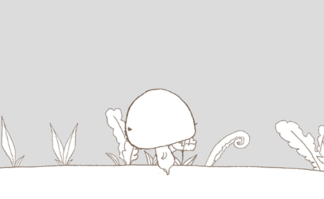
実演
文字だけでは分かりにくいですよね。
それでは実際に実演していくと同時に、どうやってアニメーションを発生させるかを
みていきましょう。
.move_testはいままで説明したものをショートハンドでまとめたものです。
@keyframesの部分で動かしたい要素に0%(スタート)から100%(アニメーション終了)までの間で
CSSを指定してあげます。
.move_test{
animation: test 4s ease-in-out 2s infinite normal both;
-webkit-aanimation: test 4s ease-in-out 2s infinite normal both;
}
@keyframes test {
0% {transform: translateX(-150%); opacity: 0;}
30%{transform: translateX(4%); opacity: 1;}
70%{transform: translateX(4%); color: red; opacity: 1;}
100% {transform: translateX(500%); opacity: 0;}
}
@-webkit-keyframes test {
0% {-webkit-transform: translateX(-150%); opacity: 0;}
30%{-webkit-transform: translateX(4%); opacity: 1;}
70%{-webkit-transform: translateX(4%); color: red; opacity: 1;}
100% {-webkit-transform: translateX(500%); opacity: 0;}
}
まとめ
いかがでしたか?
今までJavaScriptやFlashでつくらなればいけなかったアニメーションをCSSで簡単に表現し、工夫次第で、CSSだけでもユーザーの目をひく質の高いインタラクションを実現することができます。
IE10以降やGoogle Chrome、Firefox最新版などのモダンブラウザと呼ばれるものであれば、遠慮なくつかえるので、ぜひ試してみてください。
RECENT POSTS

Vol.198
From parent–child bonds to community: The future of education that nurtures diversity and designs relationships

Vol.197
Exploring the future of environmental design integrating vision, diversity, and a future-oriented perspective

Vol.196
Vision-making for diverse and future-oriented education: Interpreting the future of learning through environmental design

Vol.195
“One Health” and Japan — Toward an Era of Integrating Humans, Animals, and the Environment

Vol.194
The benefits and challenges of digital education in the AI era, and the future of learning

Vol.193
Vision-Making in the age of AI — How artificial intelligence is transforming the meaning of work and the nature of organizations
TRENDING

Vol.164
Steps and strategies for internal branding to enhance employee engagement

Vol.160
What Small and Medium-sized Enterprises Should Do About Employer Branding

Vol.159
User behavior by design | The psychology of UX and behavioral change