DESIGN
Vol.26

Designer
A.K.
Expressive traditional French colors
What we introduce here is not merely a collection of “color samples,” but rather traditional French colors—colors imbued with the contexts of climate, history, fashion, and art, so to speak, “colors shaped by the spirit of France.” Colors themselves tell stories; choosing a color can evoke memories, and using color can express esprit—wit, refinement, and a distinctive sense of French identity. In fields such as branding, design, spatial production, and fashion, “color” carries meanings far beyond simple appearance. In this article, we will first explore the “origins” of these colors, then trace their practical use in “everyday life, fashion, and art,” and finally examine their depth through comparisons with Japanese color traditions. We hope to provide designers and brand strategists with inspiration that goes beyond simply choosing colors.
INDEX
1. The Origins of Traditional Colors: Reading Colors Through History and Symbolism
2. The Contexts of Fashion, Art, and Culture Expressed Through Color
3. 36 Traditional Colors of France
4. Three Perspectives for Applying Traditional French Colors to Design
5. Differences in the Perception of Color Between Japan and France
6. Color Swatches Used by Designers
7. Conclusion: The Meaning of Choosing “Traditional Colors” in Design


1. The Origins of Traditional Colors: Reading Colors Through History and Symbolism
When discussing traditional French colors, the most symbolic combination is undoubtedly “blue (bleu),” “red (rouge),” and “white (blanc).”
Many people likely think immediately of the French national flag. For example, the coat of arms of Paris uses blue and red, which later became one of the origins of the national flag and France’s traditional color scheme.
Traditional French colors are arranged in the tricolor pattern of blue, white, and red.
Blue is associated with Saint Geneviève, the patron saint of Paris, while red is linked to Saint Denis, the martyr saint of Paris. White, meanwhile, symbolized the monarchy and was regarded as the “ancient French colour,” with royal white flags continuing to be used even during the revolutionary era. These colors were later adopted into the cockade system and national flag designs during the French Revolution after 1789, eventually becoming established as the modern tricolor flag of blue, white, and red.
1-1 The Story of Blue, Red, and White: Beginning with Paris and the Kingdom
When discussing traditional French colors, the most symbolic combination is undoubtedly “blue (bleu),” “red (rouge),” and “white (blanc).”
Many people likely think immediately of the French national flag. For example, the coat of arms of Paris uses blue and red, which later became one of the origins of the national flag and France’s traditional color scheme.
Traditional French colors are arranged in the tricolor pattern of blue, white, and red.
Blue is associated with Saint Geneviève, the patron saint of Paris, while red is linked to Saint Denis, the martyr saint of Paris. White, meanwhile, symbolized the monarchy and was regarded as the “ancient French colour,” with royal white flags continuing to be used even during the revolutionary era. These colors were later adopted into the cockade system and national flag designs during the French Revolution after 1789, eventually becoming established as the modern tricolor flag of blue, white, and red.
1-2 Dynasties, Monograms, and the Evolution of Heraldic Colors
Furthermore, the heraldic colors of the French royal dynasties—particularly the House of Bourbon, symbolized by “gold fleur-de-lis on a blue background”—became deeply rooted in French color culture. Shades of indigo or cobalt blue eventually came to be established as the traditional “Bleu de France.” These symbolic colors of royalty, the church, and cities gradually evolved into customary colors through their use in aristocratic formal wear, religious paintings, and architectural design, eventually reaching the status of “traditional colors” imbued with cultural meaning.

1-3 A Vocabulary of Colors Born from Landscape, Materials, and Everyday Life
French traditional colors are not defined solely by the symbols of dynasties and cities; they also include color names born from climate, materials, and everyday life—such as “Champagne,” “Macaron,” “Bordeaux,” and “Jaune Printemps.”
These are not merely “beautiful colors,” but names that carry regional, environmental, and cultural contexts: the pale gold of sparkling wine from the Champagne region, the lavender fields of Provence in southern France, or the deep reddish-purple tones inspired by Bordeaux wine.
For example, the color called “Macaron” refers to a pastel-toned intermediate shade between pale beige and coffee hues, evoking the texture and soft sheen of the sugar-and-almond pastry itself. These color names each carry their own “story.”
2. The Contexts of Fashion, Art, and Culture Expressed Through Color
2-1 “Distinctively French” Use of Color in Fashion
When discussing French fashion, one of its defining characteristics is the use of colors that feel classic and elegant, yet at times infused with refined playfulness. Colors such as “Beige Chanel” and “Café au lait” belong precisely to this tradition.
In addition, combinations like “black, navy, and white with a single accent color” are often described as embodying “Parisian chic.”
There are also examples in which the names of traditional colors themselves are adopted as brand names or collection titles, turning color into a means of telling a brand’s story.
2-2 The Lineage of Color Across Art, Interior Design, and Architecture
In the history of painting, France has played a major role as a center of color innovation. From the era of Jean Auguste Dominique Ingres and Eugène Delacroix to Impressionism, Post-Impressionism, and modernist architecture, the role of color evolved dramatically.
The vivid shade known as “Bleu de France” has served as a symbolic color in many contexts, ranging from royal heraldry to the national color used in French motorsports.
In the realms of interior design and architecture, traditional colors helped shape the atmosphere of cities and eras—for example, in the decoration of the Palace of Versailles and in the architectural styles of Paris during the Art Nouveau and Art Deco periods. The original article also introduced many examples of color palettes spanning architectural styles from the Middle Ages to Postmodernism.
2-3 The Intersection of Culture and “Esprit Through Color”
In French, the word “esprit” refers to intelligence, wit, and spirit, and color is deeply connected to this idea of esprit. For example, the difference between French people perceiving the sun as “yellow” and Japanese people perceiving it as “red” reflects not merely a visual difference, but a cultural difference in the way color is interpreted and expressed.
Another characteristic of French culture is the literary and poetic resonance embedded in color names themselves. Names such as “Rose Pompadour,” “Bleu de Monet,” “Vert Olive,” and “Champagne” connect color swatches to a person, object, or cultural reference. When such names are incorporated into branding and design concepts, color itself becomes a medium of storytelling.
Approaching design from this perspective allows us to move beyond simply choosing a color because it “looks beautiful,” and instead consider how that color communicates history, climate, and culture.
3. 36 Traditional Colors of France

Marie Antoinette
#D61925
R:220 G:91 B:120
CC:9% M:77% Y:33% K:0%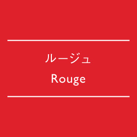
Rouge
#DF212C
R:223 G:33 B:44
C:5% M:96% Y:83% K:0%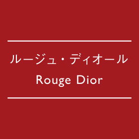
Rouge Dior
#A31B20
R:163 G:27 B:32
C:35% M:100% Y:100% K:12%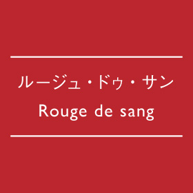
Rouge de sang
#BB262E
R:187 G:38 B:46
C:25% M:96% Y:85% K:5%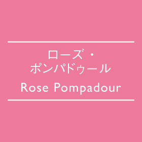
Rose Pompadour
#ED7A9B
R:237 G:122 B:155
C:0% M:65% Y:15% K:0%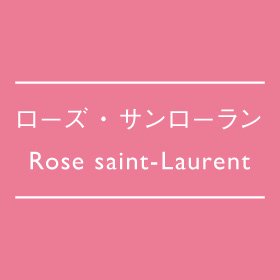
Rose saint-Laurent
#EC7B96
R:236 G:123 B:150
C:1% M:64% Y:20% K:0%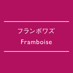
Framboise
#B21160
R:178 G:17 B:96
C:33% M:100% Y:38% K:0%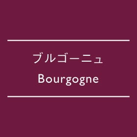
Bourgogne
#6E1A3F
R:110 G:26 B:63
C:59% M:100% Y:61% K:24%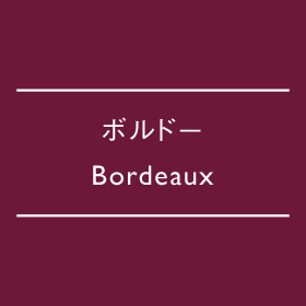
Bordeaux
#6D1839
R:109 G:24 B:57
C:57% M:100% Y:66% K:28%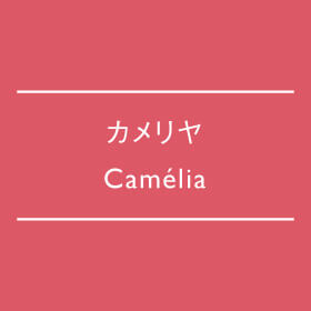
Camélia
#DD5866<
R:221 G:88 B:102
C:9% M:78% Y:45% K:0%
Crevette
#ED6E4E
R:237 G:110 B:78
C:0% M:70% Y:65% K:0%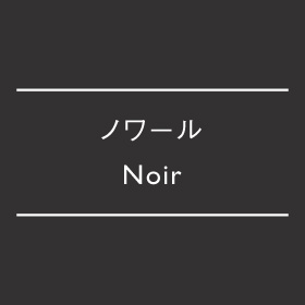
Noir
#333132
R:51 G:49 B:50
C:79% M:75% Y:72% K:47%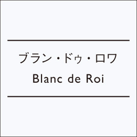
Blanc de Roi
#F7F9FC
R:247 G:249 B:252
C:4% M:2% Y:1% K:0%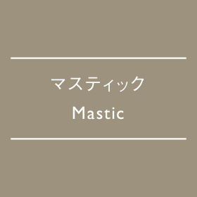
Mastic
#9D927E
R:157 G:146 B:126
C:45% M:41% Y:50% K:0%
Chocolat
#683722
R:104 G:55 B:34
C:56% M:80% Y:93% K:34%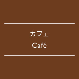
Café
#6D3C1F
R:109 G:60 B:31
C:52% M:76% Y:95% K:35%
Jaune printemps
#FFD900
R:255 G:217 B:0
C:0% M:15% Y:100% K:0%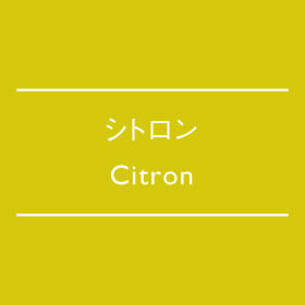
Citron
#D5C80C
R:213 G:200 B:12
C:21% M:16% Y:94% K:0%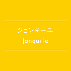
Jonquille
#FDCE00
R:253 G:206 B:0
C:0% M:22% Y:100% K:0%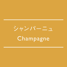
Champagne
#DCA541
R:220 G:165 B:65
C:15% M:40% Y:80% K:0%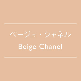
Beige Chanel
#E6BE9F
R:230 G:190 B:159
C:10% M:30% Y:36% K:0%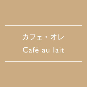
Café au lait
#CAAB81
R:202 G:171 B:129C:24% M:35% Y:50% K:0%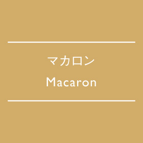
Macaron
#D1AC69
R:194 G:155 B:63
C:21% M:35% Y:63% K:0%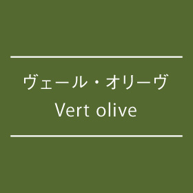
Vert olive
#546930
R:84 G:105 B:48
C:72% M:51% Y:100% K:13%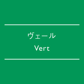
Vert
#009856
R:0 G:152 B:86
C:84% M:14% Y:84% K:0%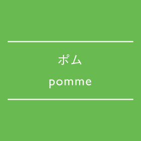
pomme
#69BA50
R:105 G:186 B:80
C:64% M:5% Y:85% K:0%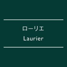
Laurier
#043A33
R:4 G:58 B:51C:93% M:67% Y:77% K:44%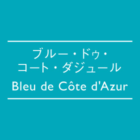
Bleu de Côte d'Azur
#00A8BA
R:0 G:168 B:186
C:78% M:8% Y:28% K:0%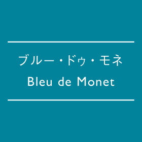
Bleu de Monet
#00839B
R:0 G:131 B:155
C:91% M:32% Y:35% K:0%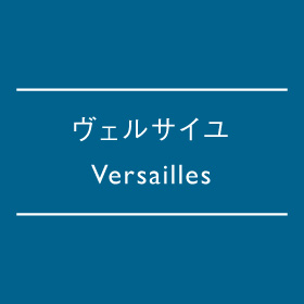
Versailles
#00628D
R:0 G:98 B:141
C:97% M:57% Y:31% K:0%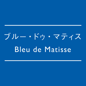
Bleu de Matisse
#005BA9
R:0 G:91 B:169
C:98% M:60% Y:3% K:0%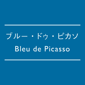
Bleu de Picasso
#006BA0
R:0 G:107 B:160
C:94% M:50% Y:20% K:0%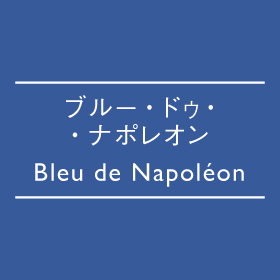
Bleu de Napoléon
#375A9A
R:55 G:90 B:154
C:84% M:66% Y:13% K:0%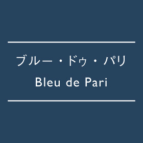
Bleu de Paris
#26435E
R:38 G:67 B:110
C:91% M:77% Y:50% K:14%
Lapis lazuli
#27468B
R:39 G:70 B:139
C:91% M:78% Y:17% K:0%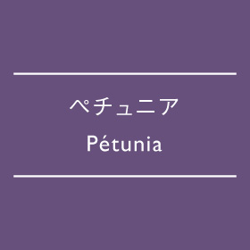
Pétunia
#67507C
R:103 G:80 B:124
C:70% M:75% Y:32% K:1%
4. Three Perspectives for Applying Traditional French Colors to Design
3-1 Perspective ①: Choosing Colors That Carry a Story
When selecting colors, having an origin, symbolism, or a meaningful background story can become a powerful asset in brand design.
For example, using the color name “Bleu de Côte d’Azur” immediately evokes images of the southern French coastline, horizons, and lagoons. In fact, among the 36 traditional colors, many names are derived from places and landscapes.
By incorporating such “place-based” or “historically rooted” naming into a brand or corporate website’s color palette, the colors themselves become part of the value proposition and worldview of the brand.
3-2 Perspective ②: Creating a “French Atmosphere” Through Color Combinations
Traditional colors become even more expressive when considered not only individually, but also in relation to one another through color combinations. For example: • The tricolor combination of blue (Bleu), white (Blanc), and red (Rouge), inspired by the national flag, functions in fashion as a symbol of refined classicism. • The combination of beige tones (such as Beige Chanel), navy, and white is often associated with the timeless Parisienne style. • Using complementary relationships—such as the contrast between champagne tones and cobalt blue—can create a sense of “sunlight and shadow” or “elegant contrast.” When adopting such color schemes, considering not only hue but also gradation, texture, light reflection, and material quality allows colors to transcend flat visual combinations and instead create a living presence within spaces and fashion.
3-3 Perspective ③: Leveraging Differences Between Japanese and French Color Perception
Understanding the differences between Japanese and French perceptions of color can lead to greater differentiation and deeper insight in design.
As mentioned earlier, Japanese people often associate the sun with the color red, whereas many French people perceive the sun as yellow.
Similarly, associations such as “apple = green” or “moon = white” are also cited. These are excellent examples of how the relationship between colors and motifs differs across cultures.
Therefore, in branding and globally oriented visual design, it is important to consider how colors are perceived differently by Japanese audiences versus within French cultural contexts, and to “translate the story” behind color names and palettes accordingly. For example, instead of simply translating “Vert Olive” as “olive green,” describing it as “a deep green inspired by the olive groves of southern France” can convey a much richer sense of the color’s cultural background.
Histoire — History Edition
Moyen — Medieval

Baroque — Baroque

“The Arcadian Shepherds” by Nicolas Poussin, one of the leading French painters of the 17th century
Source: https://w.wiki/DNAZ
Rococo — Rococo

“Pilgrimage to Cythera” by Antoine Watteau, one of the leading French painters of the 18th century
Source: https://collections.louvre.fr/en/ark:/53355/cl010061995
Empire — Empire

Art Nouveau — Art Nouveau

“The Slav Epic” by Alphonse Mucha, a graphic designer who represented the Art Nouveau movement
Source: Wikipedia: Alphonse Mucha
Art Déco — Art Deco

“The City of Paris” by Robert Delaunay, a French painter active during the first half of the 20th century
Moderne — Modern

“Unité d’Habitation” in Marseille, France, designed by the renowned French architect Le Corbusier
Postmoderne — Postmodern

The “Centre Pompidou,” a multidisciplinary cultural complex located in Paris, France
Paysage — Landscape Edition
Côte d’Azur — French Riviera

Champ de lavande — Lavender Fields

Lavender fields in Provence, southern France
Source: https://imgur.com/fields-of-lavender-provence-france-1002x674-dFiVl
Colmar — Colmar

Le Puy-en-Velay — Le Puy-en-Velay

The townscape of Le Puy-en-Velay, part of the UNESCO World Heritage “Routes of Santiago de Compostela in France”
Automne — Autumn Scenery

The Tuileries Garden in Paris during autumn
Source: http://kabegamihd.com/index.php/2013/11/07/1-432/
5. Differences in the Perception of Color Between Japan and France
Is the Sun Red or Yellow?

You can start to get a sense of the characteristics of French color aesthetics.
Next, let’s talk about the differences in color perception between France and Japan.
When you think of the color of the sun, what color comes to mind?
Many people might answer yellow or white, while others may think of the red from the Japanese flag or the orange of the evening sky.
In France, when people are asked about the color of the sun, most of them reportedly answer yellow.
The image below shows the sun as depicted in the famous French book The Little Prince.

In this way, perceptions of color differ depending on where people live and how they interpret the things they have seen.
In France, some people also associate apples with green and the moon with white.
There are various theories about the number of colors in a rainbow—some people say five colors, while others say seven.
Why Is That?
Even when looking at something as simple as color, it is fascinating to see how differences in climate, geography, culture, history, and fashion can all influence the way colors are perceived and expressed.


6. Color Swatches Used by Designers
Color Swatches for Accurate Color Verification
This is the French edition of the color swatches introduced in INSIGHTS VOL.21.
These are actual physical color swatches used by art directors, designers, brand managers, and printing directors when checking colors.
While searching for colors online is convenient, it is also important to explore colors from real physical samples.
Here, we introduce the “DIC Color Guide: Traditional French Colors.”
7. Conclusion: The Meaning of Choosing “Traditional Colors” in Design
As we have seen throughout this article, traditional French colors carry the following meanings and values:
• Colors with meaning, connected to history, regions, and symbolism
• A means of expressing “Frenchness” across fashion, art, and branding
• A vocabulary of color that supports brand language and worldview through color schemes and sensory design
• Differentiation and storytelling that leverage cultural and perceptual differences in color between Japan and France
For professionals involved in art direction, design, and brand management, deeper value is created when colors are accompanied by language such as “this color reflects a certain region” or “this color name carries a particular cultural background.”
If your project involves intentions such as “adopting a color axis inspired by France” or “incorporating traditional colors into a brand identity,” consider approaching it as a set of “color name, origin, and narrative.” By doing so, colors become more than simply beautiful—they allow the story a brand wishes to tell to become visually tangible through color itself.
Reference: Kazuo Jo (2010), “Knowledge of Color” (Seigensha)
Reference: Kazuo Jo (2011), “French Color Combinations” (PIE International)
Reference: Kazuo Jo (2014), “The Traditional Colors of France” (PIE International)
Reference: DIC Graphics Corporation, DIC Color Guide “Traditional Colors of France,” 4th Edition
INDEX
1. The Origins of Traditional Colors: Reading Colors Through History and Symbolism
2. The Contexts of Fashion, Art, and Culture Expressed Through Color
3. 36 Traditional Colors of France
4. Three Perspectives for Applying Traditional French Colors to Design
5. Differences in the Perception of Color Between Japan and France
6. Color Swatches Used by Designers
7. Conclusion: The Meaning of Choosing “Traditional Colors” in Design
RECENT POSTS

Vol.203
What Is Design Management

Vol.202
Why Hiring No Longer Works— Redesigning Organizations and Decisions for an Uncertain Age

Vol.201
How to Choose a Branding Agency: 5 Criteria to Avoid Failure

Vol.200
Design Management: A Practical Guide for SMEs and Startups to Drive Real Results

Vol.199
How to Rebuild Brand Competitiveness: A Practical Guide to Brand Management for SMEs

Vol.198
From parent–child bonds to community: The future of education that nurtures diversity and designs relationships


