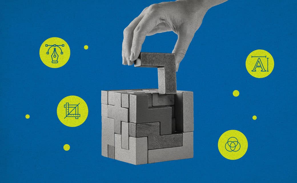
DESIGN
Vol.148

A.K.
Relying on alignment tools? Optical illusions designers should consider
What Is an Optical Illusion?
One of the most famous optical illusions is the Müller–Lyer illusion.
Look at the image below—between the two horizontal lines, which one appears longer?
Many people see the lower line as longer, but the two lines are actually the same length.
This happens because the brain, when judging the length of horizontal lines, unconsciously factors in the diagonal lines as well. In this way, we perceive something different from reality without realizing it—that phenomenon is called an optical illusion. Designers cannot avoid this phenomenon when creating design. Adjusting for this visually “correctly” is called optical adjustment (or visual adjustment). Designers manually adjust for these illusions with the human eye. There are many types of optical illusions, and here are some examples.
1. Triangle Division Illusion
Look at the diagram below. On the left is a triangle button placed in the center using an automatic alignment tool; on the right is a triangle button placed so that the triangle’s center of gravity is centered. Which one looks more balanced?
The triangle on the left often appears unbalanced even though it’s mathematically centered. This is called the triangle division illusion. To solve this, you need to manually adjust so that the triangle’s center of gravity is truly centered.
Incidentally, for shapes other than triangles, how are visual adjustments made? Let’s examine logos and symbol graphics in our daily lives.
Although this may be a slight digression, how is visual adjustment handled in shapes other than triangles? I would like to examine logos and symbolic graphics found in our everyday surroundings.
The figure above shows signage graphics for the Tokyo Metro Fukutoshin Line that happened to catch my eye while traveling. Using this signage graphic as a reference, I placed the “F” at the center of the circle using Illustrator’s alignment function. As a result, it becomes clear that the position of the “F” differs from that in the original design. This is easier to see if guide lines are drawn. In the Fukutoshin Line route mark, the “F” is positioned slightly to the right, indicating that an optical adjustment has been applied in consideration of visual weight.
As shown here, simply aligning a layout numerically using alignment functions can result in a visual impression that differs significantly from how it appears to the human eye.
2. Upper Distance Exaggeration Illusion
Now look at two vertically stacked circles. Many people perceive the upper circle as larger.
But both circles are actually the same size. This phenomenon—where the upper element appears larger than the lower one even though they are the same—is called the upper distance exaggeration illusion.
Look around you: letters such as “8” or “H” also demonstrate this. When colored backgrounds are applied, the space above is often slightly smaller to visually balance for this illusion.
Designers apply this adjustment in many everyday UIs—for example, even Google’s search bar caret is slightly visually adjusted.
3. Shape-Based Illusions
Consider a set of identical-sized squares, circles, and triangles side by side. Compare them: the circle and triangle often look smaller than the square even though all three shapes are exactly the same size.
This is also a type of optical illusion. The brain interprets area differently depending on shape, so it perceives circles and triangles as smaller than squares. For typography, this leads to adjustments such as overshoot—where curves are slightly extended so they visually align with straight-edged letters.
4. Color Area Effect
Consider two rectangles of different sizes but the same color. Which one looks brighter?
Often, the larger one appears brighter even though they have the same color. This is known as the color area effect. Designers use this knowledge to visually adjust—for example, in Facebook’s UI, text and icon colors that appear to be the same are actually slightly different. The smaller-area text is made slightly darker or lighter so both appear visually matched.
Conclusion
Optical illusions are rooted in the human visual system, and for designers, they are a phenomenon that cannot be ignored. Designers must carefully adjust visual elements so users can perceive content and design comfortably. Knowing the different types of optical illusions and how they arise makes it possible to address visual discomfort appropriately when creating design.
Don’t rely solely on automatic alignment tools—train your eye to notice when something looks off.
RECENT POSTS

Vol.198
From parent–child bonds to community: The future of education that nurtures diversity and designs relationships

Vol.197
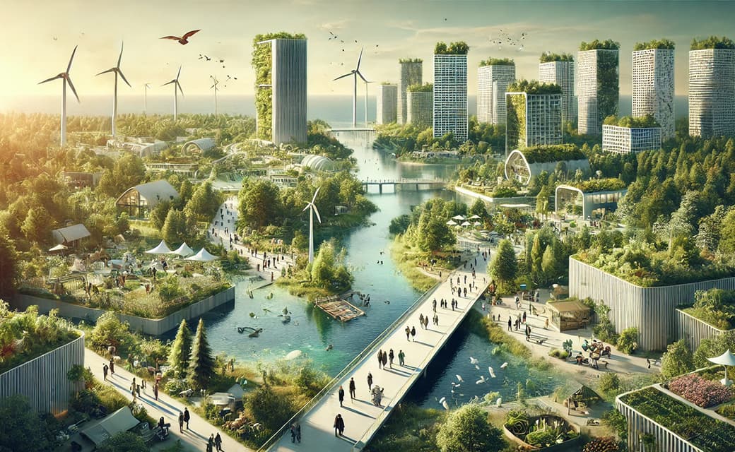
Exploring the future of environmental design integrating vision, diversity, and a future-oriented perspective

Vol.196
Vision-making for diverse and future-oriented education: Interpreting the future of learning through environmental design

Vol.195
“One Health” and Japan — Toward an Era of Integrating Humans, Animals, and the Environment

Vol.194
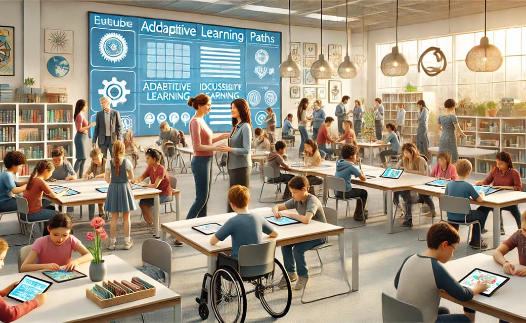
The benefits and challenges of digital education in the AI era, and the future of learning

Vol.193
Vision-Making in the age of AI — How artificial intelligence is transforming the meaning of work and the nature of organizations