DESIGN
Vol.46

Illustrator
M.N.
Summer Traditional Colours and Patterns

Colours associated with summer, colours that make you feel summer
In Japan, colours of nature are deeply connected with traditional colours. When you think “summer,” what images come to mind? It’s not just the vivid colours of flowers under the strong summer sun. It can also be the rich green of plants thriving with life, the glossy wetness of summer rain, or colours that express coolness from shade and water. Just the single word “summer” evokes different impressions like “heat,” “gloss,” or “coolness.” All of these fit the summer image.
Next, we’ll show how to express summer’s heat and coolness using colours.
Traditional colours that make you feel summer’s heat
Under the strong sunlight of summer, the high-saturation colours of flowers and plants appear even more vivid. Here are some colours taken from flowers blooming in summer or plants growing full of life.
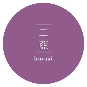
二藍
Futaai
#888ABC
R:136 G:138 B:188
C:58% M:50% Y:0% K:0%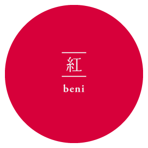
紅
Beni
#C41A41
R:196 G:26 B:65
C:10% M:100% Y:53% K:10%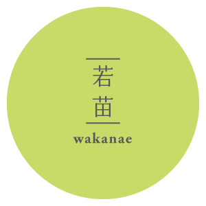
若苗
wakanae
#C7DC68
R:199 G:220 B:104
C:10% M:0% Y:53% K:14%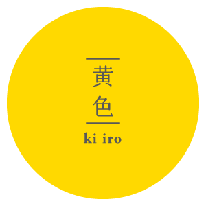
黄色
kiiro
#FFD900
R:187 G:38 B:46
C:25% M:96% Y:85% K:5%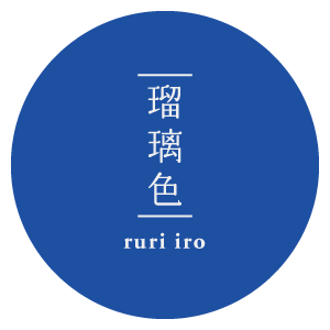
瑠璃色
ruriiro
#004898
R:000 G:72 B:152
C:100% M:70% Y:0% K:10%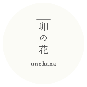
卯の花
unohana
#FBFBF6
R:251 G:251 B:246
C:1% M:0% Y:4% K:2%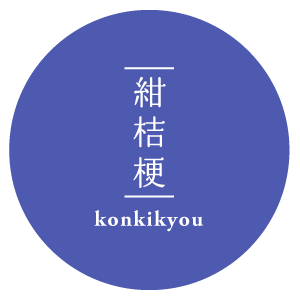
紺桔梗
konkikyo
#4d5aaf
R:77 G:90 B:175
C:56% M:49% Y:0% K:31%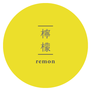
檸檬色
remoniro
#ECDF2B
R:236 G:223 B:43
C:7% M:13% Y:83% K:0%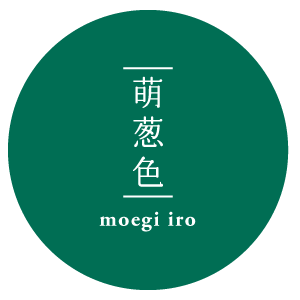
萌葱色
moegiiro
#006e54
R:0 G:110 B:84
C:100% M:0% Y:24% K:57%
Summer colour combinations
日本では重色(かさね色)という、衣装を重ねて着るときに季節の色を参考にしていました。
重色(かさね色)をそのままデザインの配色として使用するには、色同士の彩度が強いため扱いづらい場合があります。
この場合は彩度対比の効果を考えて配色します。
彩度対比とは彩度の異なる色が影響しあい、色の鮮やかさが変わって見えることです。
彩度が高い色はより鮮やかになるのに対し、彩度が低い色はよりにぶく、くすんで見える対比効果です。
彩度の高い色がよりはっきり見えるため、さし色などポイントで使用すると効果的です。
また、白を組み合わせることで夏の日差しを表現できます。

References


Traditional colours that feel cool in summer
When it’s hot, don’t you imagine water, the sea, or the shade of trees? Cool-toned colours are often used for that feeling.
While blue is the typical colour for “cool feeling”, other examples include wakatake iro (young bamboo green) or kogamo iro (mallard duck green) which evoke summer plateau scenes.
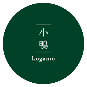
小鴨
kogamo
#00595D
R:136 G:138 B:188
C:58% M:50% Y:0% K:0%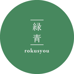
緑青
rokusho
#557857
R:85 G:120 B:87
C:48% M:0% Y:31% K:47%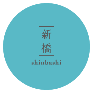
新橋
shinbashi
#FFD900
R:85 G:120 B:217
C:65% M:0% Y:15% K:0%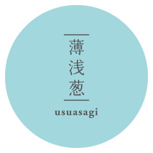
薄浅葱
usuasagi
#00A4AC
R:0 G:164 B:172
C:76% M:5% Y:29% K:0%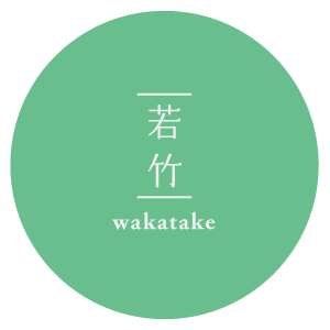
若竹色
wakatake
#7CC28E
R:124 G:194 B:142
C:60% M:0% Y:60% K:0%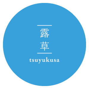
露草
tsuyukusa
#71A4D9
R:113 G:164 B:217
C:60% M:23% Y:0% K:0%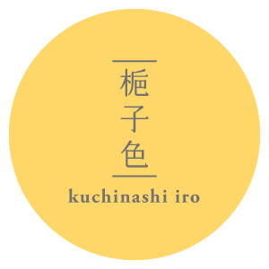
梔子色
kuchinashiiro
#FFD768
R:255 G:215 B:104
C:0% M:16% Y:59% K:0%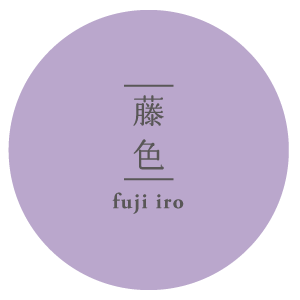
藤色
fujiiro
#BAA7CC
R:186 G:167 B:204
C:32% M:37% Y:6% K:0%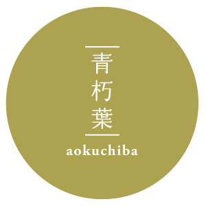
青朽葉
aokuchiba
#ada250
R:173 G:162 B:80
C:0% M:6% Y:54% K:32%
Colour combination examples
全体を寒色系にまとめて涼しさを出したり、白を加えて清潔で爽やかな印象になります。


References
飲料系のWebサイトでは涼しげな色をグラデーションさせて清涼感を演出しています。


Extracting colours from photographs
It may also be effective to pick colours from summer-photographed pictures. When extracting with the eyedropper tool in Photoshop etc., you might find the colour you get is more saturated or slightly different than what you see with your eyes. In that case, adjust by comparing what you see and what is extracted.

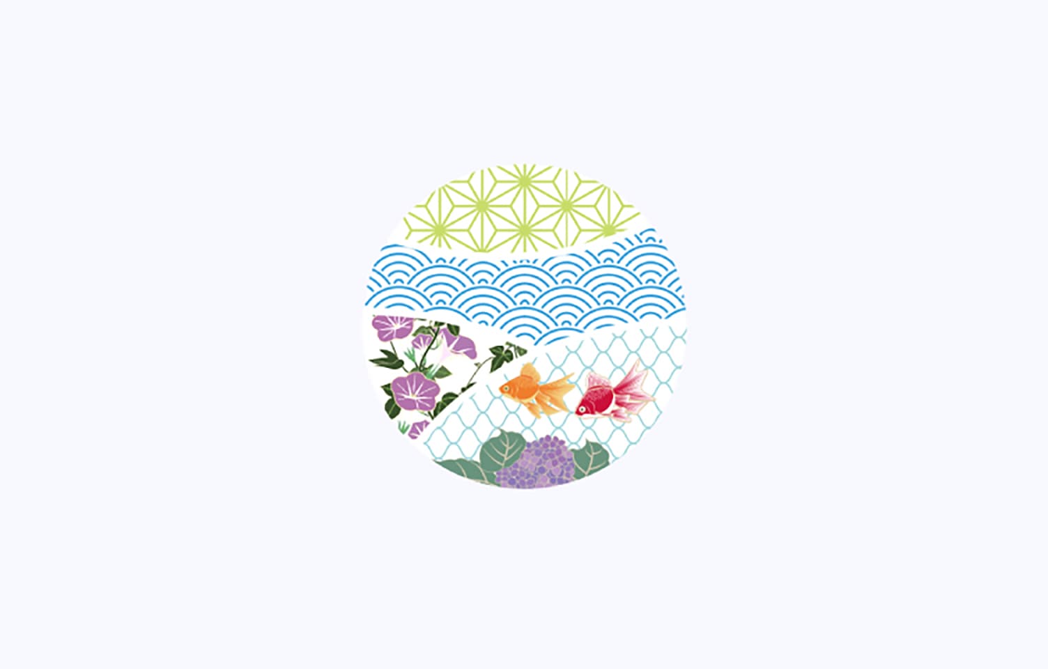
Summer-specific patterns
Combining summer colours with seasonal motifs further highlights the sense of summer. Here are some patterns we introduce.
Asanoha-mon (Hemp-leaf pattern)
麻の葉を連想することから名付けられた模様です。
麻の葉文様は、正六角形を基調とした幾何学的な連続模様で、大麻の葉に似ていることから名づけられました。
まっすぐに伸び成長する縁起物として古くから親しまれ、現代でもWebサイトや商品のパッケージに多く使われています。
シンプルな幾何学文様は、着物のように全体に敷き詰める配置でも落ち着いた印象を与えます。

Seikaiha (Blue ocean wave pattern)
自然の穏やかな波が続く様子を表現した文様です。
名前の由来とされるのは、平安時代から伝わる舞楽(ぶがく)の演目の一つで、二人で舞う平舞(ひらまい)で、寄せる波、引く波を表現した雅楽の装束や工芸品にも用いられる伝統的な文様です。
未来永劫にわたり平穏な生活が続くようにという願いが込められた吉祥柄とされており、厄除けの意味合いを持つこともあります。
麻の葉紋と同じく幾何学的な文様は背景やちょっとしたアクセントとして使用できます。

「組子文様デザイン 青海波 日本伝統装飾|組子のタニハタ」
出典:https://www.tanihata.co.jp/products/tn-111/
※紹介する事例の引用元サイトは、一定の期間を過ぎるとクローズする可能性がありますので、ご了承ください。
Kingyo-mon (Goldfish pattern)
模様としての歴史は浅いですが、夏物の着物や浴衣に用いられ、涼やかさと遊び心を表現する文様として親しまれ、華やかな姿が人気の高い文様です。
一匹だけでも作品にインパクトが出るだけでなく、流水や水草と合わせて涼しく見せられます。また、金魚は富や幸福、多産などの縁起物とされ、金運上昇や魔除けの意味も持つとされています。

Asagao-mon (Morning-glory pattern)
夏に咲く代表的な花です。浴衣や着物の文様として使われることが多く、暑さをしのぐアイテムや涼しげなデザインの中に使われます。
朝顔は原産は日本ではなく、ヒマラヤとされています。奈良時代から平安時代にかけて薬用として遣唐使によって中国から伝えられたといわれ、文化・文政の江戸時代には観賞用として流行し、浮世絵などに盛んに用いられました。

Ajisai-mon (Hydrangea pattern)
紫陽花は日本固有の花で、「万葉集」にも詠まれているほど古くから知られ、鎌倉時代に演芸化されました。青紫色の大きな花が好まれて、江戸時代には陶磁器や蒔絵などの工芸品に琳派が巧みに文様化しています。
紫陽花は梅雨から盛夏にかけて咲く花のため、初夏の季節感を表す文様として、雨のイメージを連想させ、涼しげな印象を与えます。
雨に濡れ一層美しく涼しげに咲く文様は、暑い日に用いるグッズの柄としても多く使われています。

「nugoo 【拭う 鎌倉】 本染め手拭いの通販ページ
(あじさい小道 折りたたみ日傘)」
https://nugoo-next.stores.jp/items/65ee9e1fea2af0002b4a1cfd
Summary
Japanese traditional colours were born from the changing of the four seasons, natural scenery, and everyday life in Japan. Since ancient times we have captured nature — grass, trees, flowers, sky, sea, earth, light, and shadow — in dyeing, painting, pottery, etc.
Therefore, the colour names are not just names, but contain scenery, feelings, and poetic meaning. For example, Ai-iro (indigo) refers to deeply quiet blue from indigo dyeing; Usukurenai (light crimson) reminds of spring cherry blossoms; Moegiiro (fresh green) conveys the breath of new leaves.
Summer’s traditional colours frequently give a sense of coolness or clarity. For example, Asagi-iro (pale light blue-green) that reminds of morning glory, Mizuiro (water colour) that reminds of light on the water surface, Gunjō (ultramarine) that reflects the sea in the evening – these lightly colour the summer scene.
These colours have been used in yukata or kimono along with seasonal motifs, giving a visual “cooling effect”.
出典:ANA鳥取美人物語
出典:冷やして愉しむ 夏の日本酒 「日本酒がうまい!」推進委員会
出典:綾鷹(あやたか)
出典:組子文様デザイン 青海波 日本伝統装飾|組子のタニハタ
出典:染の安坊
出典:nugoo 【拭う 鎌倉】 本染め手拭いの通販ページ
参考:きもの用語大全
参考資料:伊達千代「配色デザイン見本張」
参考資料:佐野 敬彦「日本の配色」
RECENT POSTS

Vol.198
From parent–child bonds to community: The future of education that nurtures diversity and designs relationships

Vol.197
Exploring the future of environmental design integrating vision, diversity, and a future-oriented perspective

Vol.196
Vision-making for diverse and future-oriented education: Interpreting the future of learning through environmental design

Vol.195
“One Health” and Japan — Toward an Era of Integrating Humans, Animals, and the Environment

Vol.194
The benefits and challenges of digital education in the AI era, and the future of learning

Vol.193
Vision-Making in the age of AI — How artificial intelligence is transforming the meaning of work and the nature of organizations