DESIGN
Vol.150

K.K
Helvetica – A Timeless Western Typeface Loved Around the Globe

Two Typeface Designers
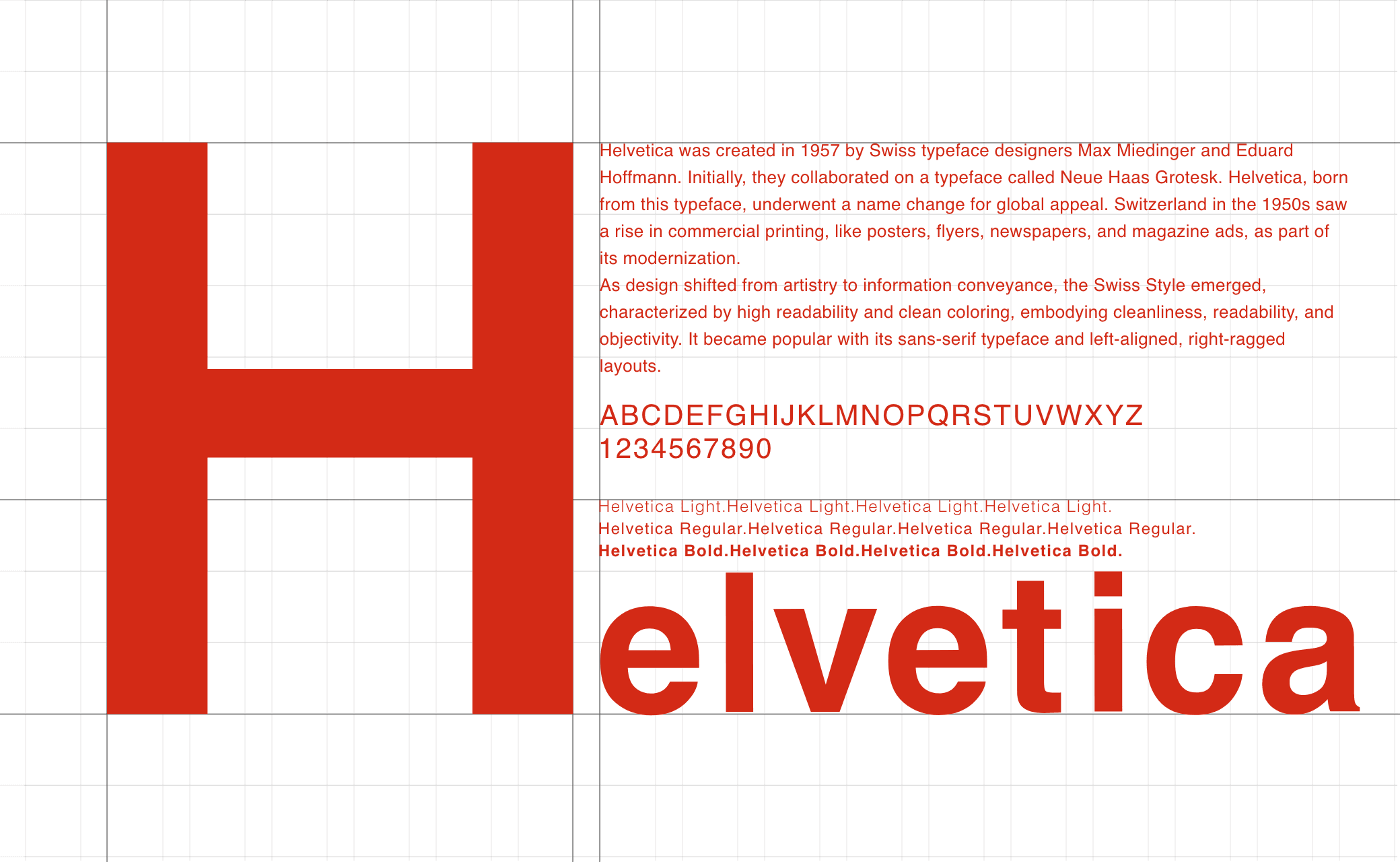
Helvetica was created in 1957 by Swiss type designers Max Miedinger (left in image) and Eduard Hoffmann (right in image). <br>
It is a sans-serif font (without decorative strokes at ends of letters). Though simple and understated, it is powerful, universal in application, and blends effortlessly into many contexts. The phrase “its lack of distinctive characteristics is its feature” is often used to describe it.<br>
Originally, the design was called Neue Haas Grotesk. Helvetica emerged when this typeface was renamed for broader, more global usability.
Research Journal「Max Miedinger」
MULTIMEDIAMAN「Eduard Hoffmann: 1892 – 1980」
Swiss Design Style
To understand Helvetica, it’s useful to look at Swiss design style of the 1950s. Switzerland, like other European nations at the time, was modernizing and commercial printing (posters, flyers, newspapers, magazines) was spreading. Design shifted from artistic expression to a focus on conveying information. The so-called Swiss Style emphasised clarity, readability, and objectivity: clean sans-serif fonts, left-aligned text, minimal ornamentation. <br>
Helvetica fit perfectly into this era because it was plain, legible, and versatile — a font that worked across many contexts without imposing personality.
Characteristics of Helvetica
Let’s look at some of the specific features that define Helvetica.
Stroke:
The horizontal strokes end cleanly; this simplicity and clarity contribute to the font’s strength.
Aperture:
The openings in letters (such as in “e”, “a”, “c”) are relatively narrow in Helvetica compared to other sans-serif fonts like Futura or Myriad. This slightly reduces expressiveness but improves readability.
Uppercase R / lowercase a:
Helvetica has subtle distinguishing features — the “R” has a curved leg that saves space and improves spacing; the “a” has a hook-like top rather than a minimalist geometric shape, giving consistent structure and rhythm.
There are two main shapes for the lowercase “a” in sans-serif typefaces.
Helvetica and Myriad feature a small hook-like curve at the top, while Futura has a simple, unadorned form without any decoration.
In Helvetica, the horizontal stroke treatment is applied consistently here as well, creating a precise and orderly impression.
Helvetica in Everyday Life
Helvetica is very familiar in our daily lives. For example:
Station Name Signs of JR East and Tokyu Corporation
Many railway station nameboards in Japan (such as those of JR East and Tokyu Corporation) use Helvetica for their English signage.
Helvetica in Everyday Products
Helvetica is also used in many everyday products.
Logos such as Post-it and Evian are designed based on the Helvetica typeface.
Helvetica Used in Familiar Corporate Logos
Familiar corporate logos use Helvetica as their base: e.g., MUJI, Panasonic, FRANFRANC, and also products with Helvetica-style branding like Post‑it and evian.
Why Is Helvetica Commonly Used for Railway Station Signage?
Because stations serve a wide range of users, including international travellers, clear readability is essential. A serif font might give an elegant image but may be harder to distinguish at a glance. A purely geometric font might look stylish, but some letters might be misread (especially by non-native users).
Accurately Communicating Information to People of All Ages and Nationalities
If the English lettering on a station name sign were set in a serif typeface, it might convey a refined or elegant image of the area.
However, because serif fonts often have very thin horizontal strokes, it can be difficult to distinguish certain letters accurately.
Now imagine if the English signage used a geometric font instead.
While such fonts have a strong and stylish design appeal, they can make it harder for foreign visitors to tell the difference between letters like “i” and “j”, which could lead to misreading station names.
Easier Reading of Japanese Vowel Letters
While studying Helvetica, I noticed how easily distinguishable the lowercase vowels “a, i, u, e, o” are.
Because every Japanese syllable contains a vowel, these letters appear frequently when Japanese words are written in the Latin alphabet.
For example, the long railway line name 「京浜東北線」 (Keihin-Tōhoku Line) becomes “Keihin-Tohoku Line” in English, naturally resulting in a sequence rich in vowel characters.
Let’s take Futura as a comparison.
Futura is a geometric typeface based on perfect circles, triangles, and squares. The letters “u” and “o” are both constructed from circular shapes, which makes their lower parts look quite similar.
From a distance, this resemblance makes it difficult to distinguish “u” from “o”, reducing legibility in signage applications.
Helvetica, by contrast, offers high legibility — for example, its “u” has a vertical stem, making it easily distinguishable from “o”.
We’ve come to understand why Helvetica is so commonly used for railway station signage.
Its high level of legibility ensures that information is conveyed accurately and reduces the likelihood of misreading.
Learning from Helvetica — The Invisible Traces
Helvetica is a typeface that strips away every unnecessary element, yet quietly carries intention within its form.
It is free of excess but never mechanical — this beautiful balance is one reason it continues to be loved around the world.
When you look closely at its details — the starting and ending points of strokes, the curvature of its lines, or the restraint in its apertures — you can sense the designers’ deliberate choices.
Understanding a font’s history and characteristics before selecting it gives your design greater depth and credibility.
Exploring the fonts that surround us in everyday life can lead to many new discoveries — and it’s genuinely enjoyable.
Take a look around you and search for your own favorite typefaces.
In doing so, you may find stories that go beyond what meets the eye.
References
- European Typefaces 2: Standard Typefaces and Techniques — by Akira Kobayashi
- Rules for Using Western Typefaces That Work in Design — by Karen Cheng
- Mojitetsu: Reading Japan’s Railway Station Signs Through Typefaces — by Yuki Ishikawa
RECENT POSTS

Vol.198
From parent–child bonds to community: The future of education that nurtures diversity and designs relationships

Vol.197
Exploring the future of environmental design integrating vision, diversity, and a future-oriented perspective

Vol.196
Vision-making for diverse and future-oriented education: Interpreting the future of learning through environmental design

Vol.195
“One Health” and Japan — Toward an Era of Integrating Humans, Animals, and the Environment

Vol.194
The benefits and challenges of digital education in the AI era, and the future of learning

Vol.193
Vision-Making in the age of AI — How artificial intelligence is transforming the meaning of work and the nature of organizations