BRANDING
Vol.101

Y.H.
Five Companies that renewed their logos in 2019

Brand and Logo Mark
For any company, a logo is one of the most important elements that symbolizes its identity.
A new logo can influence how a company is perceived, and in some cases, even impact its sales.
That is why, when designing a logo, it is essential to take user behavior into consideration.
Let’s take a look at these redesigned logos while reflecting on the intentions behind them.
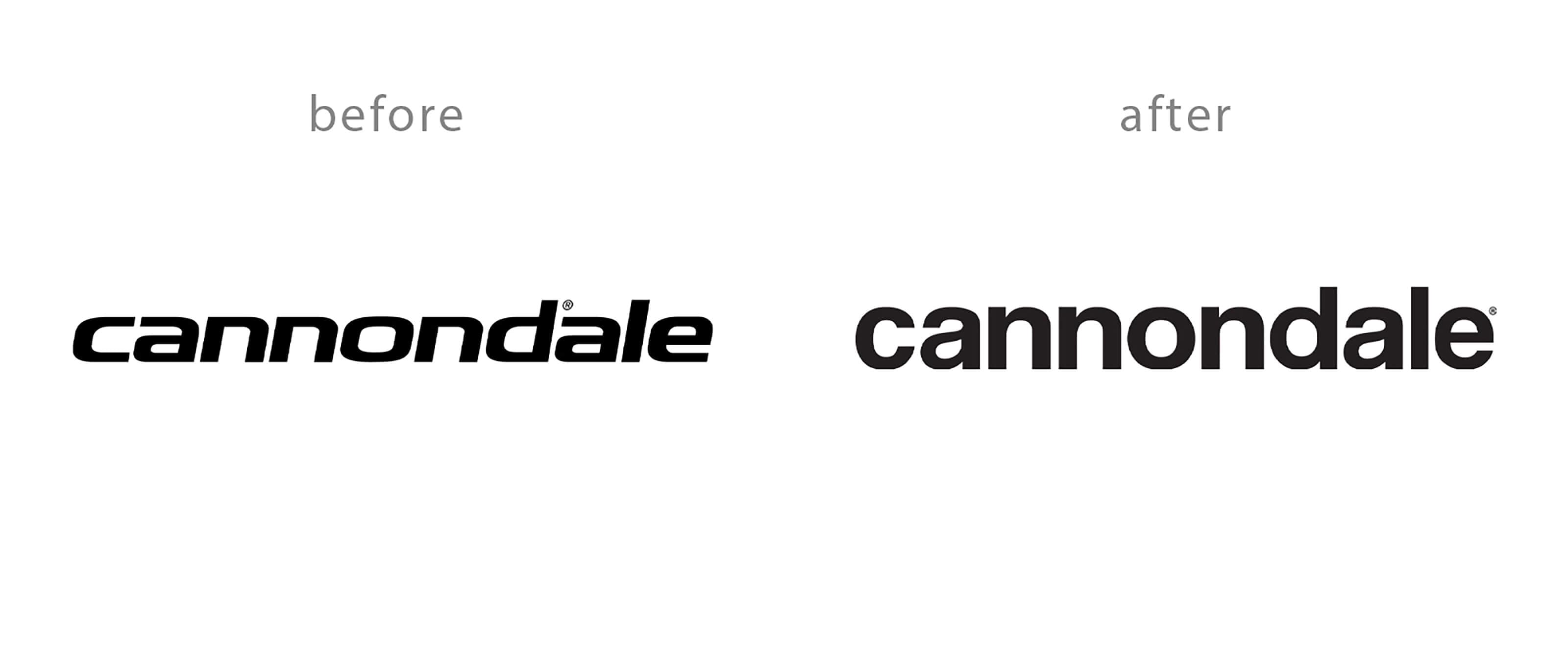
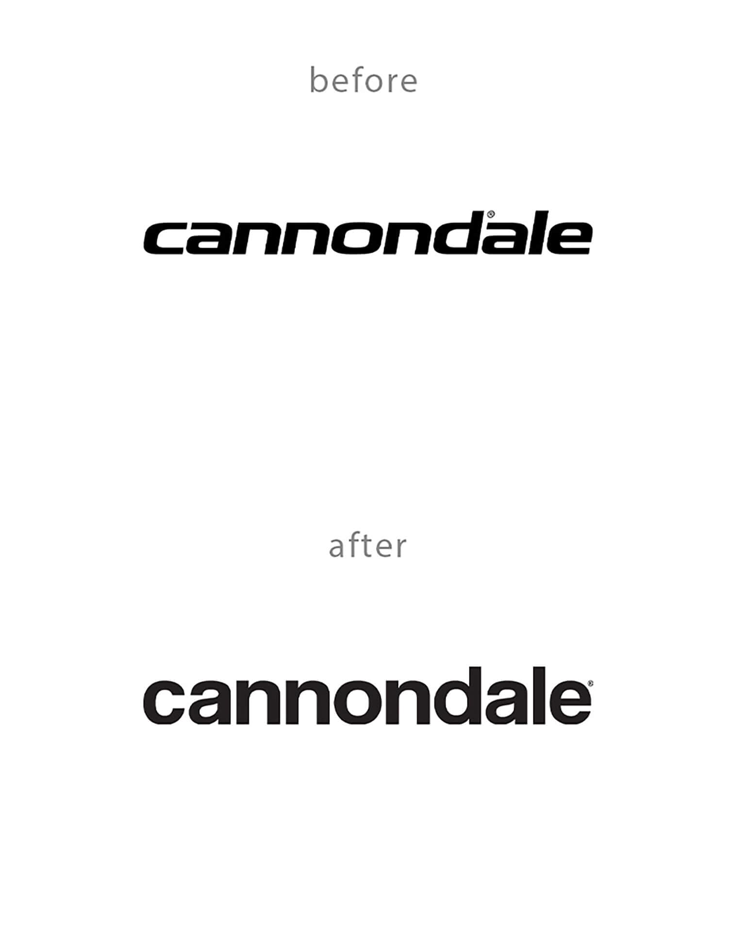
Cannondale
Starting January 18, 2020, the logo is set to change from a bold, italic typeface to a softer, rounded form.
While I am not deeply familiar with Cannondale, my impression is that the previous bold and italic typeface conveyed a sense of “stylishness” and “coolness,” likely appealing to a predominantly male fan base.
Perhaps the shift to a rounded typeface was intended to attract more female fans as well.
From a male perspective, some may feel, “It used to be so stylish and cool,” but it can also be seen as a deliberate move to differentiate from competitors in the sports industry by creating a contrasting impression.
The new logo offers high visibility, making it stand out even during races. However, when designing such changes, it is crucial to consider who the target users are and how the new logo should influence user perception and psychology.
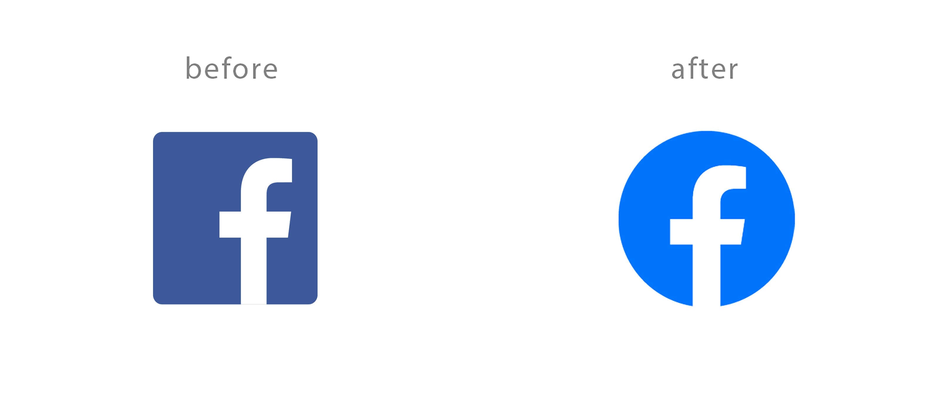
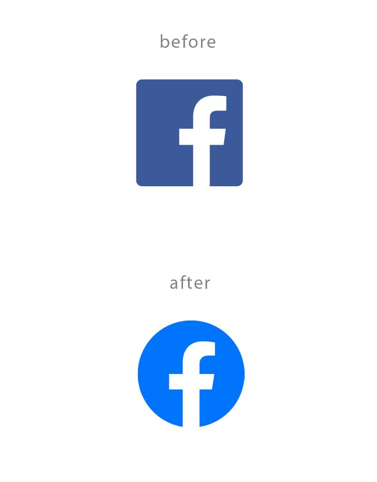
In May 2019, Facebook introduced a new logo. It had previously been updated in 2013, making this the first change in six years. One notable adjustment is the shift from a square background to a circular one.
The earlier version carried a somewhat chic, masculine impression; however, by adopting a brighter blue that conveys freshness and vibrancy, the redesign appears more accessible to both men and women.
Compared to other companies, the relatively high frequency of logo updates may reflect the rapid rise of social media and the proliferation of new applications—an effort to avoid being left behind and to continuously project a renewed image.
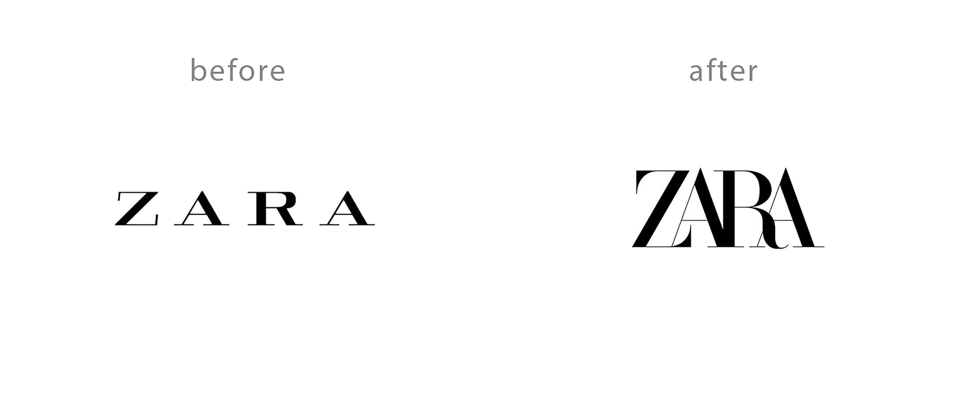
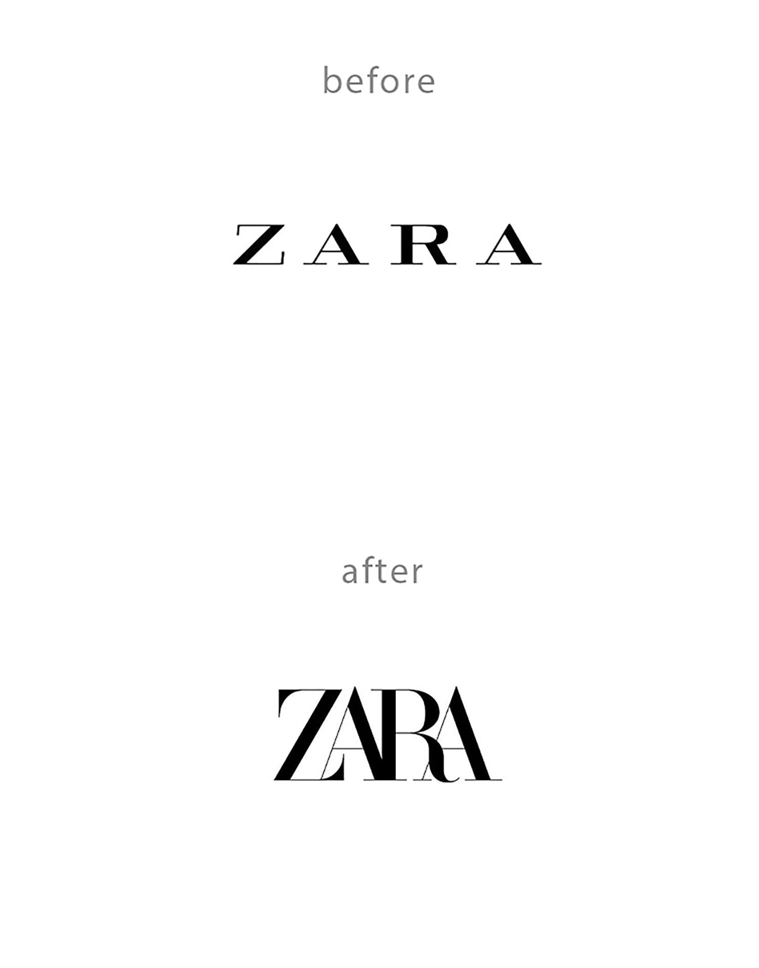
ZARA
In January 2019, the logo was updated for the first time since 2010.
The typeface has been changed to a more classic style, and in contrast to the previous version, the letter spacing has been significantly tightened.
This tighter spacing creates a sense of density, conveying greater “compactness” and “strength.”
Additionally, by thinning one of the strokes within the letters, the design avoids appearing inexpensive and introduces a refined aesthetic, allowing the “strength” of ZARA to be more clearly expressed in the logo.
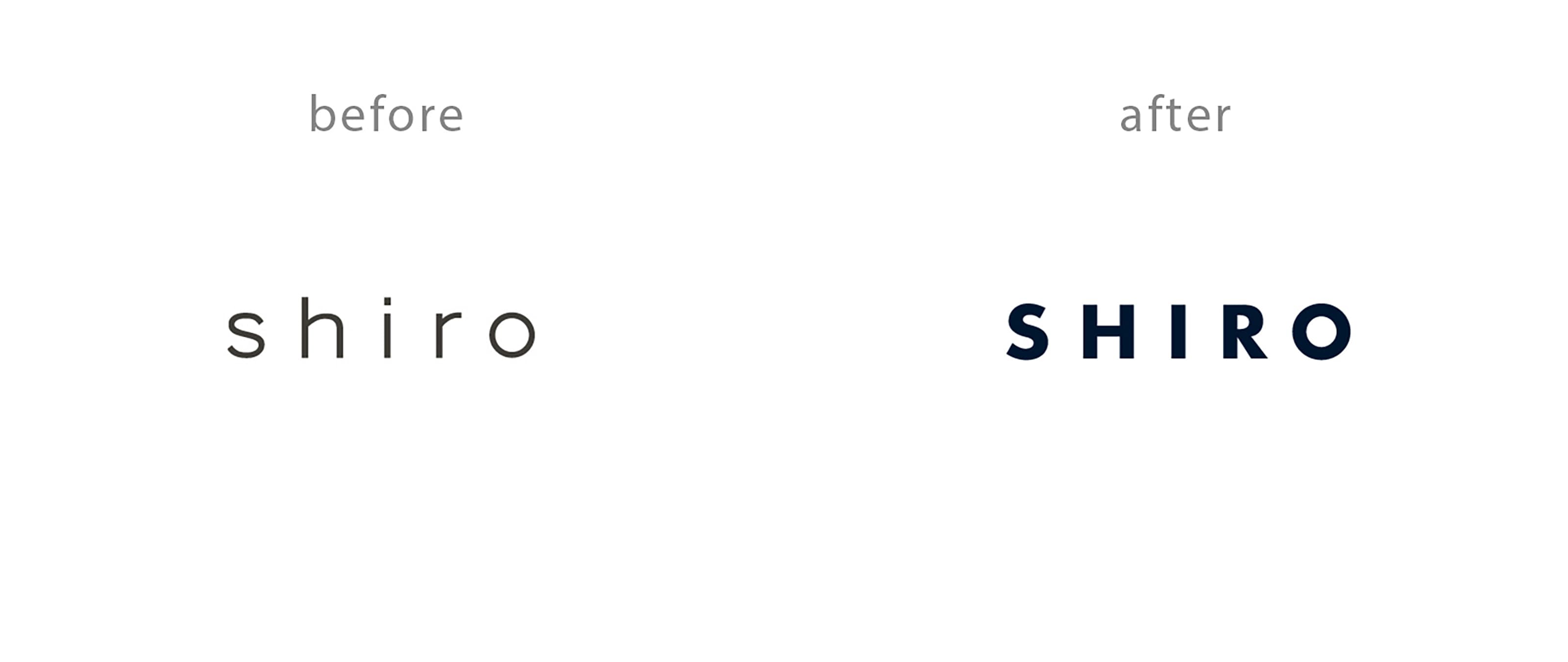
SHIRO
SHIRO, widely known for its cosmetics, introduced a new logo in September 2019.
The logo shifted from the soft and calm lowercase “shiro” to the more powerful uppercase “S H I R O.”
Curious as to why such a strong sense of boldness was emphasized, I visited the official website. There, I learned that the brand adopted navy as its key color and renewed the bottle design across all products. Alongside this, the shift to uppercase “SHIRO” reflects an intention to expand overseas while conveying, through its products, the desire to “bring happiness to the world.”
This helps explain why the brand sought to express a stronger presence in its logo—one that can stand confidently alongside others.
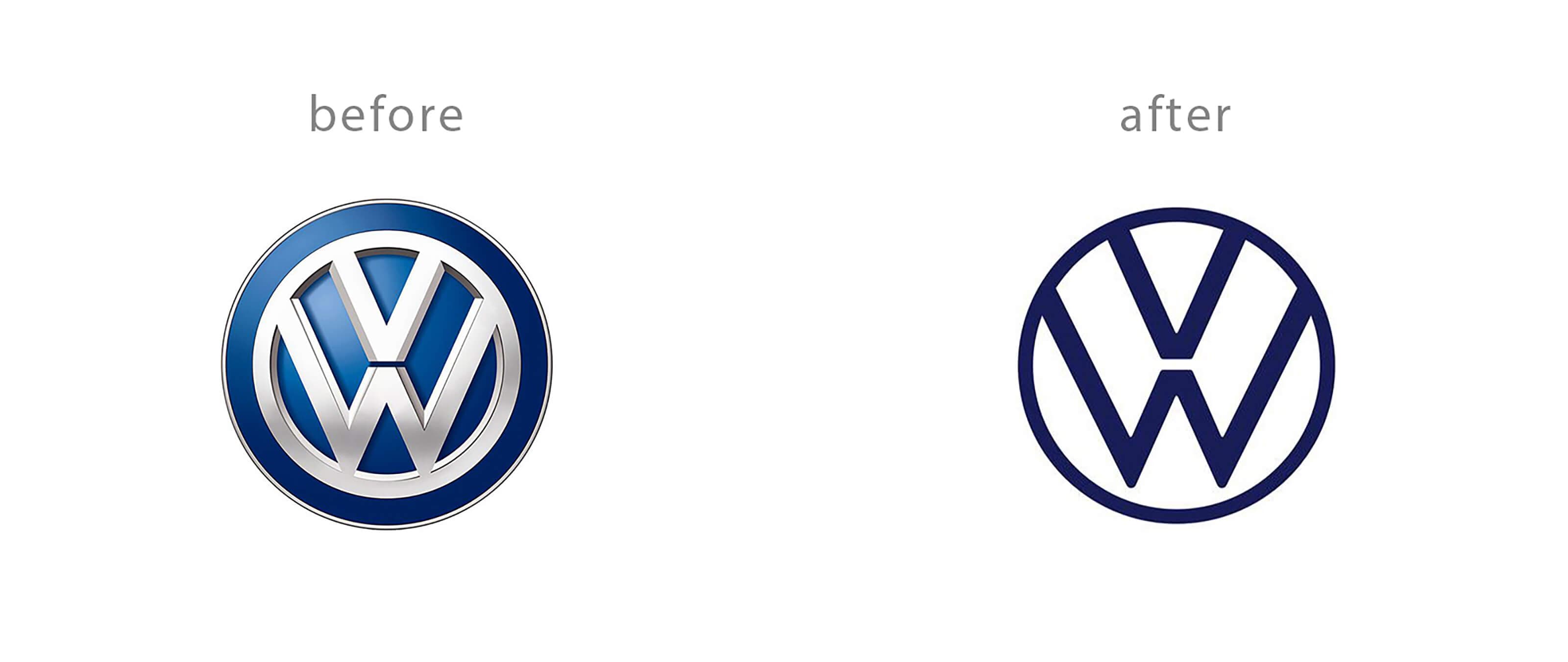
Volkswagen
In September 2019, Volkswagen unveiled its new logo at a preview event for the Frankfurt Motor Show 2019, held in Germany.
The design was changed from a three-dimensional style to a flat, two-dimensional one.
With its clear and minimal aesthetic, the logo appears to have been designed with flexibility in mind, enabling it to adapt seamlessly across various media.
In recent years, the importance of digital applications with simple and user-friendly interfaces has grown significantly. Looking ahead, the logo is expected to be flexibly placed within what is referred to as a new “moving frame.”
There are also considerations to illuminate the logo within in-car displays, suggesting that this shift to a flat and simple design may have been made in preparation for new challenges and future possibilities.
Conclusion
What did you think of these companies that renewed their logos in the first half of 2019?
As we have seen, these logo updates were not minor tweaks, but rather significant changes in form and color. While a logo is created for the company itself, I feel it ultimately exists for the user as well.
After all, a logo must leave a clear impression—so that when users see it, they instantly recognize, “This is that brand.” If that impression is negative, it can trigger a chain reaction: “If the logo design is poor, perhaps the product lacks taste as well.”
On the other hand, as discussed in the case of SHIRO, even when a company seeks to reinvent itself—refining its offerings and emphasizing its strengths with passion—users may still prefer the previous “soft and calm” logo simply because it felt more familiar and reassuring.
Whether a logo change is ultimately “good” or “bad” for users may only become clear after it is released. However, it may be beneficial to deepen one’s understanding of users beforehand—by revisiting the target audience, the context in which they encounter the logo, and the fundamental 5W1H—before proceeding with the design process.
From this perspective, a logo is both a creation and a product. As a designer, I am reminded of the importance of approaching logo design with the utmost care and consideration.
Source: Cannondale Official Website
Source: ZARA Official Website
Source: SHIRO Official Website
Source: Volkswagen Official Website
Source: Volkswagen Reference
RECENT POSTS

Vol.198
From parent–child bonds to community: The future of education that nurtures diversity and designs relationships

Vol.197
Exploring the future of environmental design integrating vision, diversity, and a future-oriented perspective

Vol.196
Vision-making for diverse and future-oriented education: Interpreting the future of learning through environmental design

Vol.195
“One Health” and Japan — Toward an Era of Integrating Humans, Animals, and the Environment

Vol.194
The benefits and challenges of digital education in the AI era, and the future of learning

Vol.193
Vision-Making in the age of AI — How artificial intelligence is transforming the meaning of work and the nature of organizations