DESIGN
Vol.93

Designer
Y.H.
The Importance of Color Palettes in Spring Design


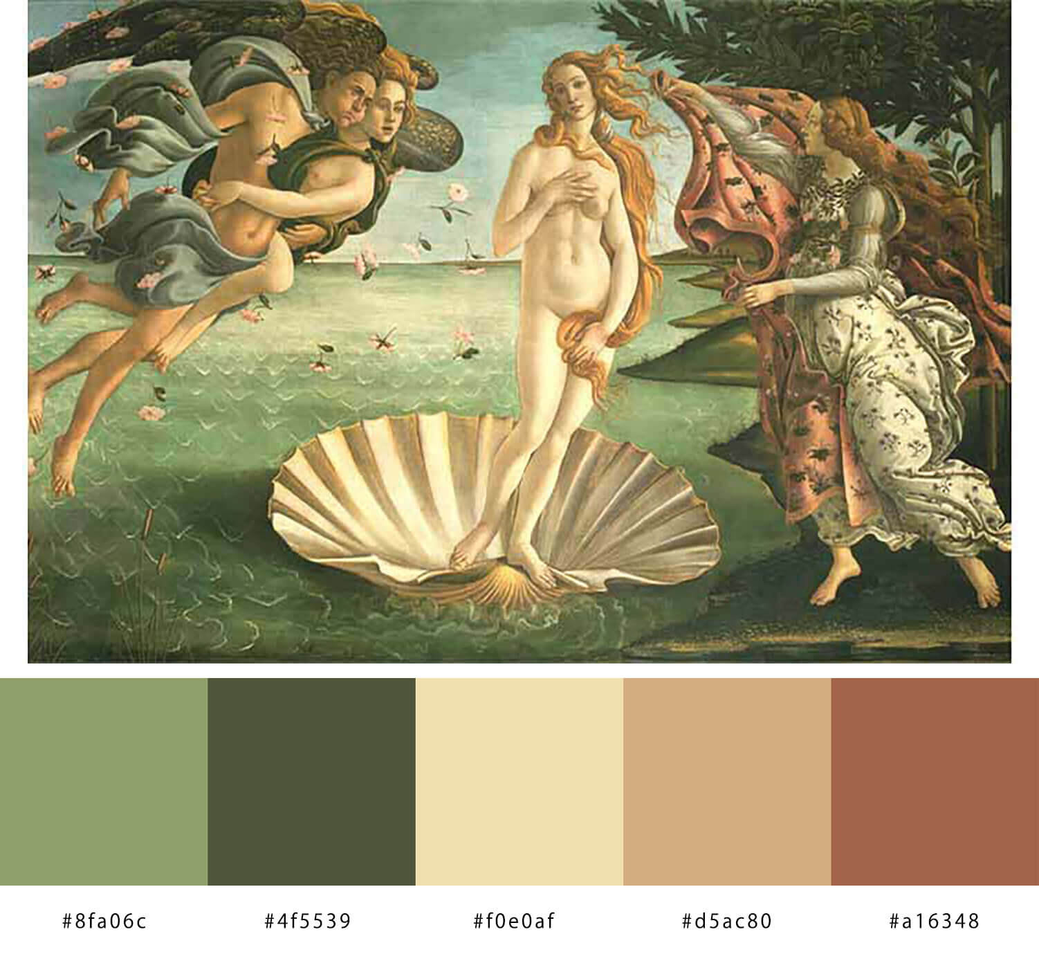
The Birth of Venus — An Elegant and Refined Spring Color Palette
“The Birth of Venus,” painted by Italian Renaissance artist Sandro Botticelli, is one of the most iconic representations of spring.
The painting depicts the birth of Venus, the goddess of love in Greek mythology. The wind gods scattering flowers and the flowing movement of fabric symbolize the arrival of spring. The floral embroidery and celebratory atmosphere further reinforce the seasonal setting.
In this painting, spring represents birth and joy.
The flowing golden hair, translucent skin tones, and soft ocean colors create a graceful and refined palette.
The color scheme combines both warm and cool tones. Venus’s skin is subtly surrounded by cooler tones, which contrast with the red robe and enhance the overall color effect.
This calm and sophisticated palette is suitable for classical and elegant design contexts.
The Birth of Venus
| Color | HEX | RGB |
|---|---|---|
| Pale Blue | #AFC7D6 | 175,199,214 |
| Skin Pink | #E6C9B2 | 230,201,178 |
| Gold Beige | #D4B483 | 212,180,131 |
| Soft Red | #C77C7C | 199,124,124 |
| Sand Beige | #EFE3D6 | 239,227,214 |
Wikipedia:The Birth of Venus
Daigo — A Delicate Spring Palette Inspired by Japanese Aesthetics
“Daigo,” painted in 1972 by Japanese artist Togyu Okumura, depicts weeping cherry blossoms at Daigoji Temple in Kyoto.
In contrast to the powerful tree trunk, the delicate pale pink blossoms create a sense of transparency and depth, expressing the subtle colors of spring.
The petals appear extremely soft and translucent, layered multiple times to create gentle color depth.
This palette is suitable for:
Japanese-style brands, Hotels and ryokan, Cultural institutions, Tourism websites.
It offers a soft and refined spring impression.

Yamatane Museum of Art
醍醐 カラーパレット
| Color | HEX | RGB |
|---|---|---|
| Sakura Pink | #F3D1D8 | 243,209,216 |
| Pale Pink | #F7E5E9 | 247,229,233 |
| Soft Gray | #D8D6D2 | 216,214,210 |
| Light Brown | #C4B7A6 | 196,183,166 |
| Warm White | #FAF8F5 | 250,248,245 |
Tulip Fields near Leiden — A Vibrant Spring Color Palette
Claude Monet’s tulip fields represent the vitality and energy of spring.
Painted in farmland near Sassenheim in the Netherlands, the composition features rhythmic placement of vibrant colors:
Red, Green, Yellow, Purple, Blue
These high-saturation colors effectively convey energy and liveliness, making them suitable for dynamic and engaging designs.

Western Painting Museum
Tulip Fields near Leiden
| Color | HEX | RGB |
|---|---|---|
| Tulip Red | #E63946 | 230,57,70 |
| Yellow | #FFD166 | 255,209,102 |
| Green | #4CAF50 | 76,175,80 |
| Blue | #457B9D | 69,123,157 |
| Purple | #9D4EDD | 157,78,221 |
Fishing in Spring — A Palette Reflecting Light and Nature
Vincent van Gogh’s “Fishing in Spring,” painted in 1887 along the Seine River, captures the changing colors of natural light.
Variations of green, gradients of blue, and reflections of light create a rich representation of spring nature. Even a single tree contains multiple color tones.
The painting expresses the rhythm of changing light and shadow, brush strokes, and color movement.
This palette creates a natural and soft impression.

art-vanGogh.com:Fishing in Spring
Fishing in Spring
| Color | HEX | RGB |
|---|---|---|
| Leaf Green | #8FB996 | 143,185,150 |
| Sky Blue | #A9D6E5 | 169,214,229 |
| Soft Green | #CAD2C5 | 202,210,197 |
| Light Yellow | #F4F1DE | 244,241,222 |
| Earth Brown | #A98467 | 169,132,103 |
Source: https://vangoghworldwide.org/artwork/F354
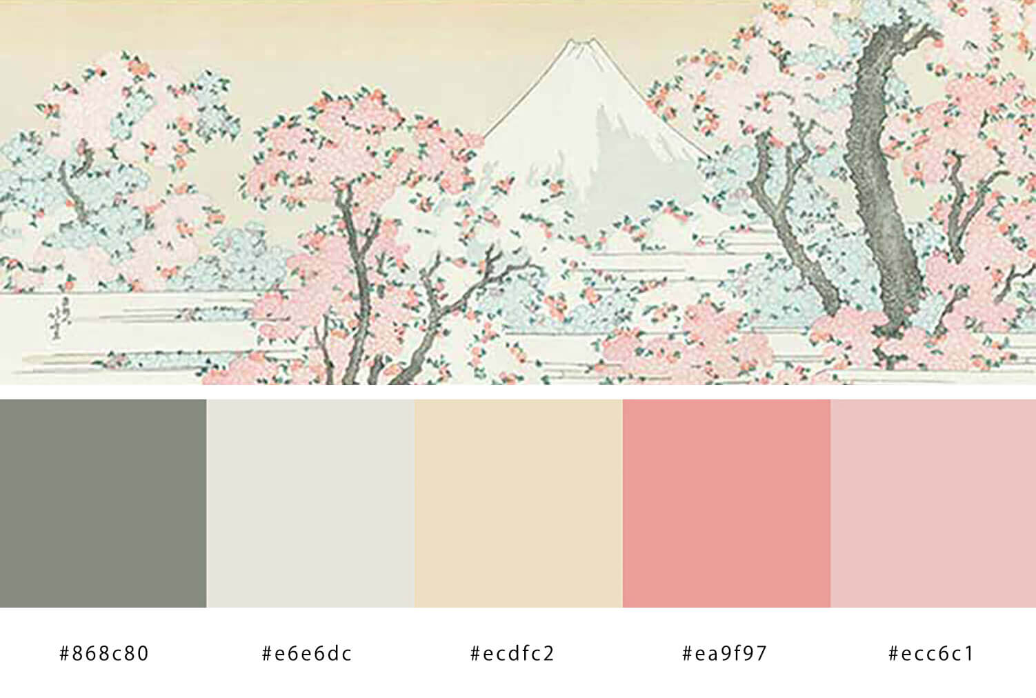
Mount Fuji Seen Through Cherry Blossoms — A Symbolic Japanese Spring Palette
“Mount Fuji Seen Through Cherry Blossoms” by Katsushika Hokusai represents a symbolic Japanese spring palette.
Cherry blossoms bloom across the scene, with Mount Fuji appearing in the center. Unlike the bold colors of Hokusai’s “Fine Wind, Clear Morning,” this work uses softer lines and transparent colors to depict spring.
The gentle atmosphere evokes calmness and serenity.
This palette is suitable when expressing both Japanese identity and spring aesthetics.
WIKIART:Mount Fuji Seen Through Cherry Blossoms
Mount Fuji Seen Through Cherry Blossoms
| Color | HEX | RGB |
|---|---|---|
| Sakura Pink | #F5C6D6 | 245,198,214 |
| Sky Blue | #BFD7EA | 191,215,234 |
| Mount Fuji Gray | #CFCFCF | 207,207,207 |
| Soft Blue | #A2C4DD | 162,196,221 |
| Light Pink | #F9E4EC | 249,228,236 |
Source: https://www.wikiart.org/en/katsushika-hokusai/mount-fuji-seen-throught-cherry-blossom
Using Spring Color Palettes in Branding
Through these spring-themed paintings, we introduced various color palettes.
Spring colors influence brand perception beyond seasonal expression.
Bright colors → freshness, Soft colors → warmth and friendliness, Vivid colors → energy and innovation.
These color choices help define brand personality.
• The Birth of Venus (Elegant)
• Daigo (Delicate)
• Tulip Fields (Vibrant)
• Fishing in Spring (Natural)
• Mount Fuji with Cherry Blossoms (Calm)
Incorporating seasonal palettes enhances the richness of design impressions.
At BOEL, we design color strategies based on brand philosophy and direction. Color is a visual element that intuitively communicates brand identity.
For this reason, color palette design is an important process in branding.
When designing for spring, consider referencing the colors found in classic paintings. They offer timeless and harmonious color combinations that continue to inspire today.
出典:Botticelli – The Birth of Venus
Source: Monet – Tulip Fields near Leiden
Source: Togyu Okumura – Daigo
Source: Van Gogh – Fishing in Spring
Source: Katsushika Hokusai – Mount Fuji Seen Through Cherry Blossoms
Reference: Color Harmony in Famous Paintings
RECENT POSTS

Vol.198
From parent–child bonds to community: The future of education that nurtures diversity and designs relationships

Vol.197
Exploring the future of environmental design integrating vision, diversity, and a future-oriented perspective

Vol.196
Vision-making for diverse and future-oriented education: Interpreting the future of learning through environmental design

Vol.195
“One Health” and Japan — Toward an Era of Integrating Humans, Animals, and the Environment

Vol.194
The benefits and challenges of digital education in the AI era, and the future of learning

Vol.193
Vision-Making in the age of AI — How artificial intelligence is transforming the meaning of work and the nature of organizations
TRENDING

Vol.164
Steps and strategies for internal branding to enhance employee engagement

Vol.160
What Small and Medium-sized Enterprises Should Do About Employer Branding

Vol.159
User behavior by design | The psychology of UX and behavioral change
INDEX
The Birth of Venus — An Elegant and Refined Spring Color Palette
Daigo — A Delicate Spring Palette Inspired by Japanese Aesthetics
Tulip Fields near Leiden — A Vibrant Spring Color Palette
Fishing in Spring — A Palette Reflecting Light and Nature
Mount Fuji Seen Through Cherry Blossoms — A Symbolic Japanese Spring Palette
Using Spring Color Palettes in Branding