DESIGN
Vol.80

N.S.
8 web design tips for seniors


Avoid Using Alphabetic Words and Katakana Terms
Whenever possible, replace labels such as “Login” with “For Members” or “Access” with “Directions” using Japanese kanji and hiragana expressions.
Special consideration should be given so that users unfamiliar with foreign loanwords written in katakana or English alphabets can easily understand the meaning of the text.
Use Larger Fonts
In general, a font size of 16px or larger is considered easier for elderly users to read. Since readability directly affects how well information is understood, font sizes should be set appropriately according to the target audience.
Provide Generous Line Spacing
Just as important as font size is line spacing.
A line-height of around 160–180% is considered easiest to read.
If the spacing is too narrow, users may lose track of the next line when moving their eyes downward. On the other hand, spacing that is too wide increases eye movement and can become tiring.
While users can change font size through browser settings, line spacing cannot usually be adjusted on the user side. Designers should therefore pay careful attention to it.
Pay Attention to Color Contrast
Ensure that there is sufficient contrast between text and background colors.
The Japanese Industrial Standard “JIS X 8341-3:2010” recommends a contrast ratio of at least 4.5:1 between text and background colors.
Conditions such as cataracts can cause vision to become cloudy or yellowish, making pale tones such as pastel colors and low-saturation colors difficult to distinguish.
Particular care should be taken with combinations such as yellow and white, which are especially hard to differentiate.
Adding functionality that allows users to switch color schemes can make websites even more accessible.
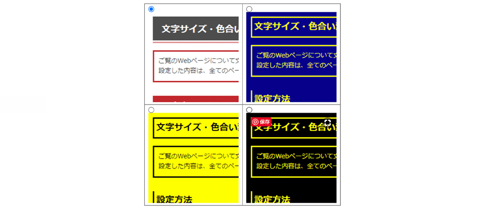
There are also free tools available for checking color contrast, so make use of them.
Make Buttons Large and Visually Tactile
Buttons and text links should be large enough to interact with easily. Ideally, primary buttons should have a width of at least 32px.
Elements such as checkboxes and pull-down menus used in forms should also be sized appropriately.
Websites should be designed with users who may have limited dexterity in mind, avoiding interactions that require precise cursor movements or tapping small targets.
In addition, flat-design buttons can sometimes appear as nothing more than colored text blocks.
Adding subtle shadows or depth helps create a sense of dimensionality, making buttons feel more naturally “clickable.”

Shiseido PRIOR
Source: https://www.shiseido.co.jp/pr/
Add Text Labels to Icons
Supplement icons with explanatory text whenever possible.
Icons are convenient because they save space, but users who are not accustomed to browsing websites may find it difficult to understand what an icon represents, or may not realize that clicking the icon reveals additional information.
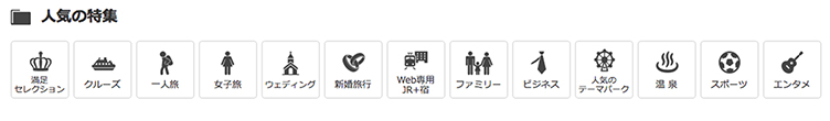
Reference: Kinki Nippon Tourist
Use Tables for Easy Comparison
When users need to compare multiple products or services on a website, summary tables that organize key information are extremely helpful.
If users have to move back and forth between pages frequently, they may lose track of where they are or how to return to the previous page. Allowing users to compare information side by side on the same page creates a more user-friendly experience.
The “LIFULL Nursing Care” website, for example, uses tables that allow users to compare elderly care homes and nursing facilities at a glance.

Place Contact Phone Numbers Within the First View
If your website offers telephone support, display the phone number within the first visible screen area.
For many elderly users, being able to immediately call and speak with someone directly when they need help provides reassurance. For users who are unfamiliar with email or inquiry forms, placing the phone number in a highly visible location is especially considerate.
Conclusion
What did you think?
Even if a website feels easy to use from the designer’s perspective, it is important to consider how a wide range of users will experience it.
By incorporating small improvements like the ones introduced above, we can create websites that are clearer, more comfortable, and easier to use for people of all ages.
References: Ministry of Internal Affairs and Communications, “2017 White Paper on Information and Communications”
Web担当者Forum
Reference: Understanding the Background and Importance of Senior-Friendly Optimization (SFO) (Part 1 of 6)
Reference: Is the Internet Still a Suspicious Place? Six Ways to Reduce Seniors’ Psychological Barriers and Help Them Feel Safe (Part 2 of 6)
Reference: Seven Techniques for Making Websites Comfortable Even for Senior Cognitive Abilities (Part 3 of 6)
Reference: Font Size Alone Is Not Enough! Seven Tips for Creating Websites Easy to Use Even with Aging Eyes and Hands (Part 4 of 6)
Reference: WebA11y.jp “Accessibility Check Tools”
Reference: LIG “The Secret to Better Design Is Typography! Five Tips for Making Text Easier to Read”
Reference: Nagano Association of Architects & Building Engineers, Suwa Branch Youth Committee “Color Planning for the Elderly” (PDF)
RECENT POSTS

Vol.203
What Is Design Management

Vol.202
Why Hiring No Longer Works— Redesigning Organizations and Decisions for an Uncertain Age

Vol.201
How to Choose a Branding Agency: 5 Criteria to Avoid Failure

Vol.200
Design Management: A Practical Guide for SMEs and Startups to Drive Real Results

Vol.199
How to Rebuild Brand Competitiveness: A Practical Guide to Brand Management for SMEs

Vol.198
From parent–child bonds to community: The future of education that nurtures diversity and designs relationships


