DESIGN
Vol.7

S.N.
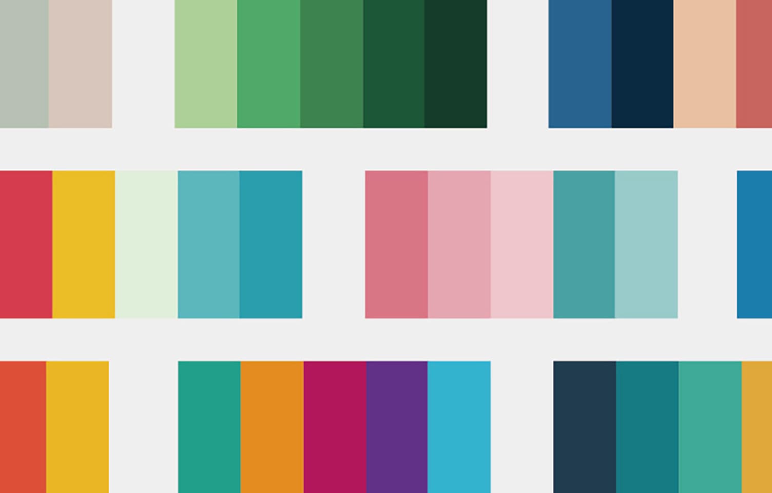
配色で整理するWebデザイン

レイアウトだけが解決方法じゃない!
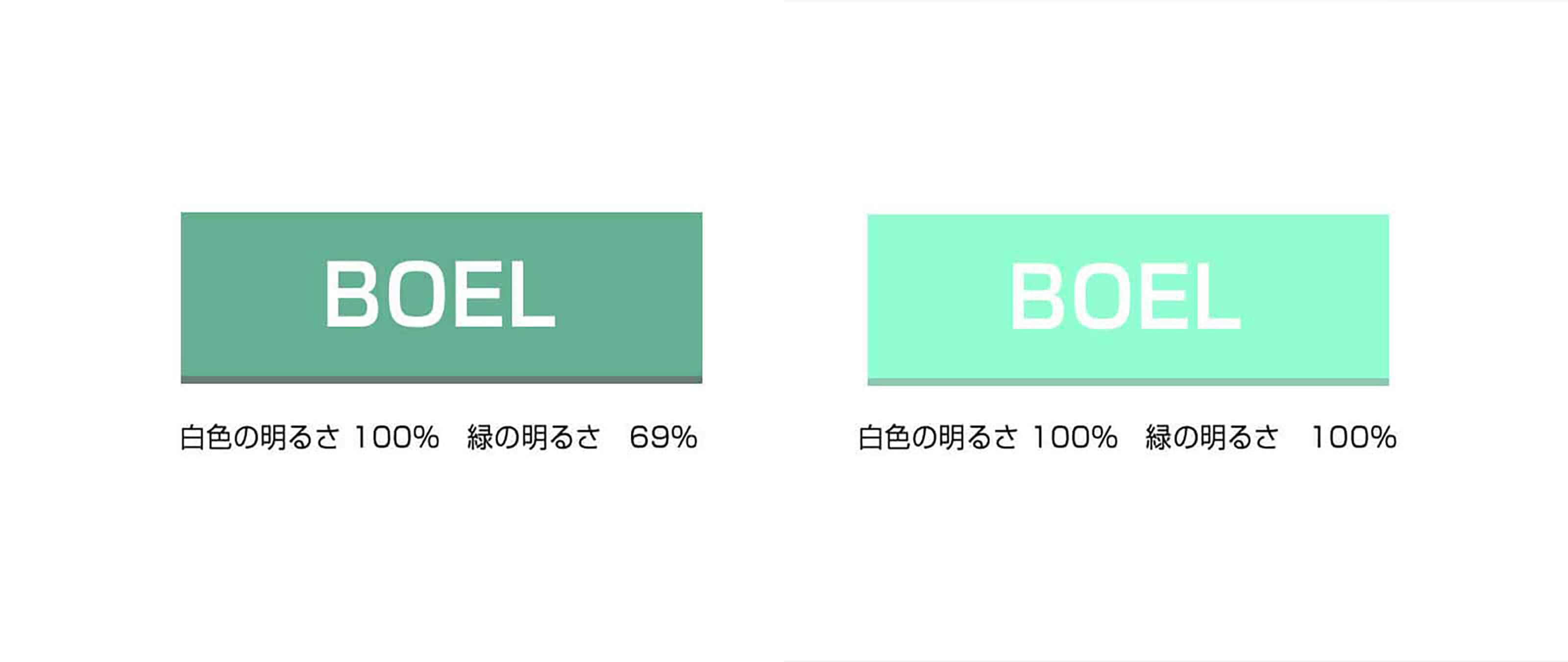
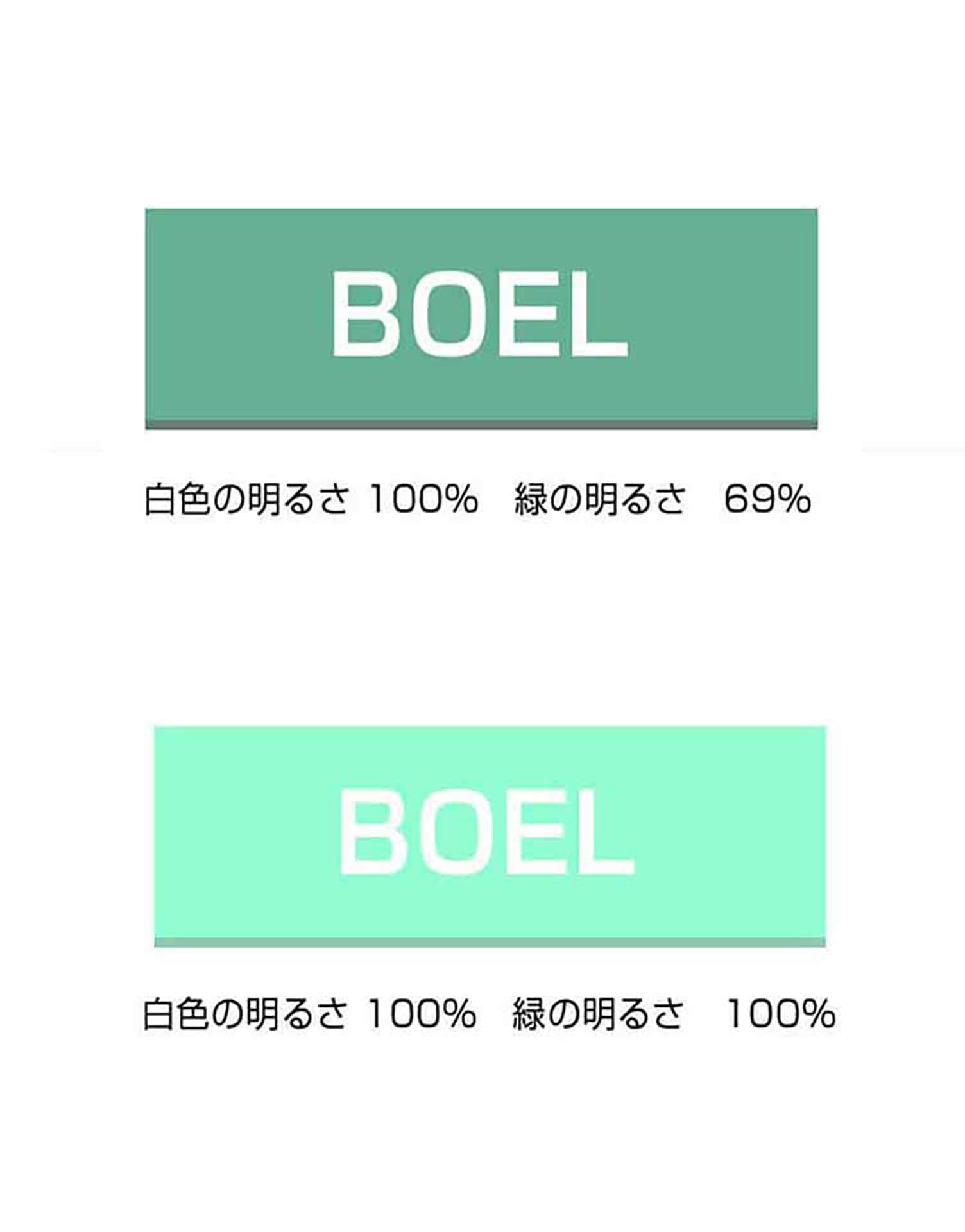
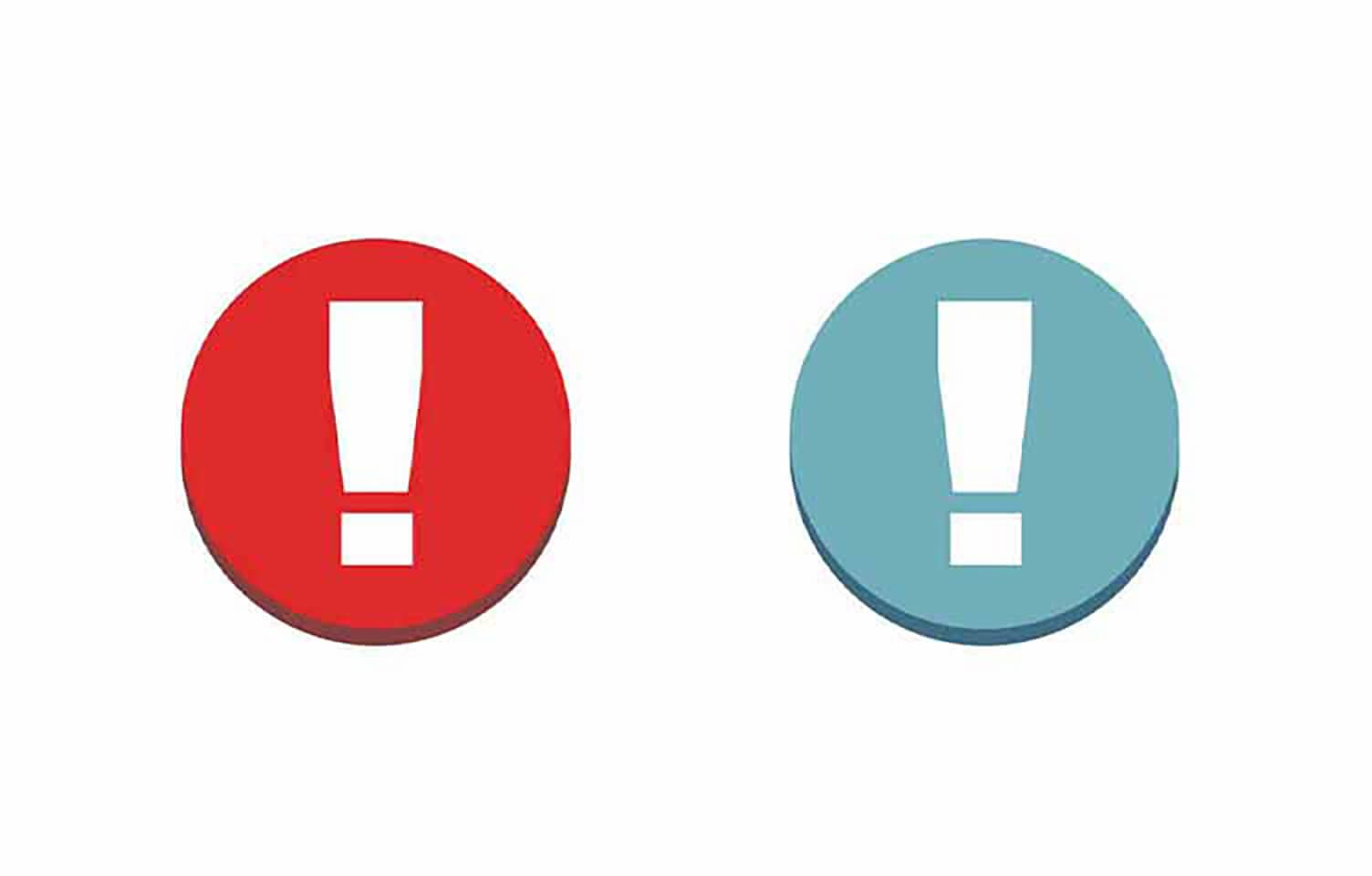
文字やボタンが目立たない理由
背景色と対象の色に明度差をつけよう。
順番に要素を見せるための効果
色で目線を移動させる「誘目性」とは?

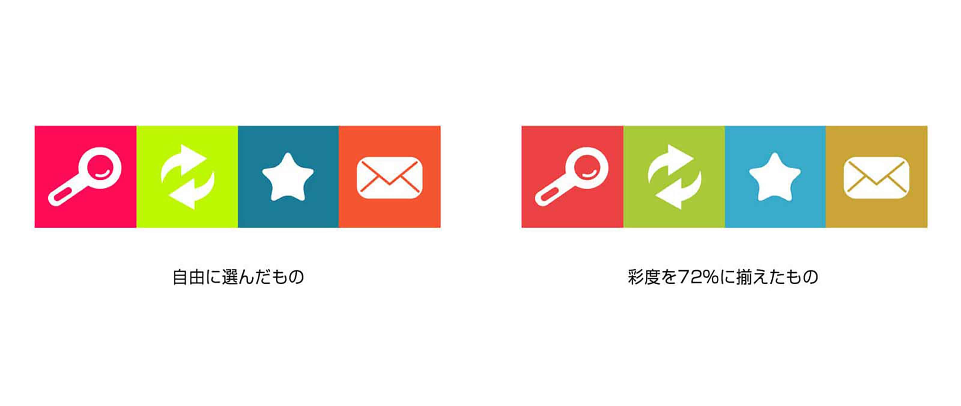
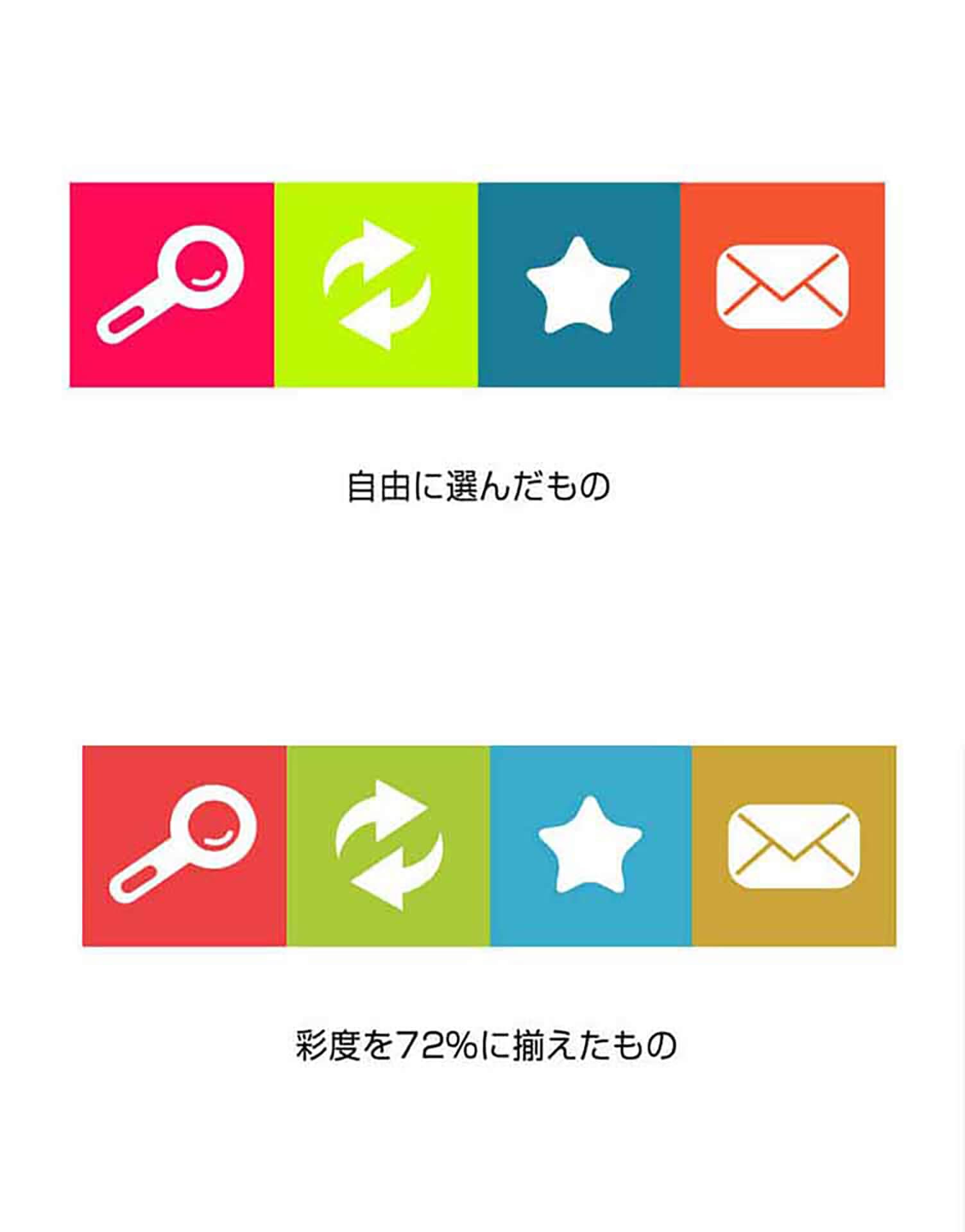
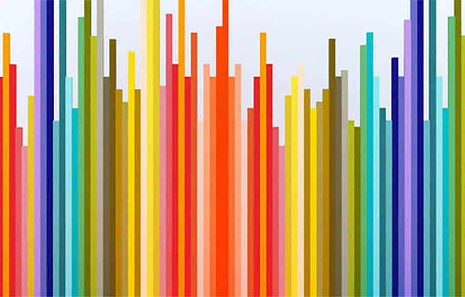
レイアウト全体の色をバランスよくまとめよう
全体をみてなにを伝えたいか考えよう

おまけ
配色に悩んだ時はツールを使ってみよう。
目的にあった色を選ぶことで、効果的な画面が作れるといいのですが、頭で考えるだけでは煮詰まることも出てくると思います。
そんなときに便利な自動で配色を選んでくれるツールがあります。 配色に悩んだときは是非参考にしてみてください。
RECENT POSTS

Vol.198
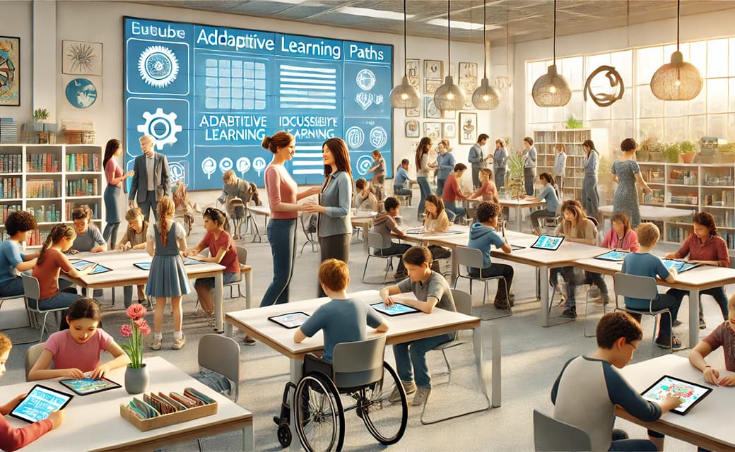
From parent–child bonds to community: The future of education that nurtures diversity and designs relationships

Vol.197
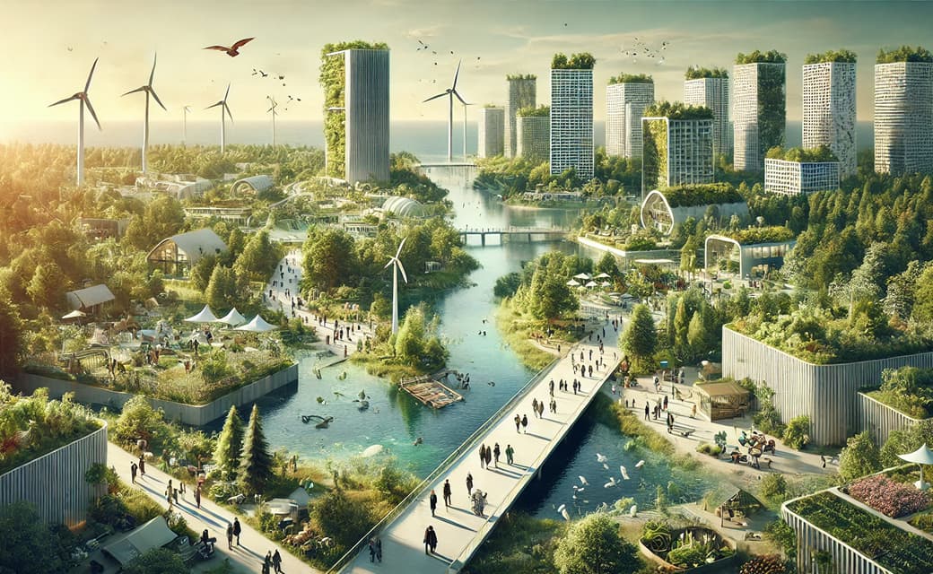
Exploring the future of environmental design integrating vision, diversity, and a future-oriented perspective

Vol.196
Vision-making for diverse and future-oriented education: Interpreting the future of learning through environmental design

Vol.195
“One Health” and Japan — Toward an Era of Integrating Humans, Animals, and the Environment

Vol.194
The benefits and challenges of digital education in the AI era, and the future of learning

Vol.193
Vision-Making in the age of AI — How artificial intelligence is transforming the meaning of work and the nature of organizations