DESIGN
Vol.69

Designer
S.N.
10 Web Design and UI Trends for 2017
INDEX
Hero Videos / Sound
Cinemagraphs
Split-Screen Layouts
Loading Animations
Storytelling
Gradients
White Framing
Animation on the Top Page
Bold Typography
Mobile-First
Conclusion


Hero Videos / Sound
When you first visit a website, the image you see in a large format is called the hero image. By combining a hero image with copy created from static images, brands make a strong impression.
The number of websites that replace this hero section with video—incorporating video as the background of the site's top page—is increasing, creating a strong impression through full-screen footage.
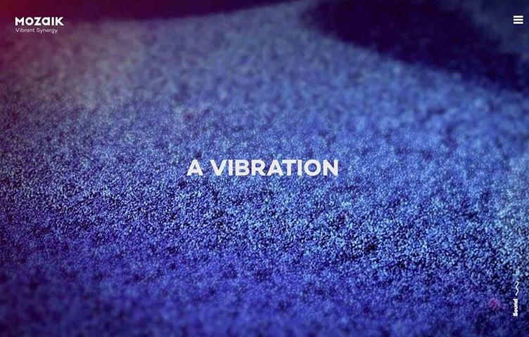
As implementation methods have shifted from Flash to JavaScript, audio can now be played, and more websites are actively incorporating music and sound. There are also websites that use UI/UX sounds—the kind used for navigation and similar elements.
While UI/UX sounds are mainstream on smartphones and apps, using them symbolically can help make brands stand out even more. By incorporating sounds that fit a website's style, brands appeal to users' ears as well as their eyes, making the website's world more impressive and rich.
Even the buttons for toggling sound on and off show creative flair and personality, becoming elements that combine playfulness with consideration for users.
Cinemagraphs
An increasing number of sites use cinemagraphs — adding motion to only part of an image — to express subtle movement.

Cinemagraph-based expression has existed for some time, but as more sites incorporate video, the issue of increased data size due to richer content has emerged.
For this reason, the technique of effectively using lightweight cinemagraphs—solving technical issues while still delivering rich content to users—is gaining attention.
Split-Screen Layouts
Amid the mainstream of large visuals covering the entire screen, split-screen layouts that divide content into multiple sections are also being seen.
There are many display variations—for example, designs where selecting one item from a split layout transitions to a full-screen view of that item, or where only one side of a left-right split scrolls while the other side shows constantly changing visuals.

BOSE
http://special.bose.eu/en/
Because multiple visuals and pieces of information can be displayed side by side on a single screen, users can see more content with less scrolling.
Loading Animations
As websites incorporate large images and videos at the top and content becomes richer, website loading times grow longer than before. Long loading times become a factor that drives users away from websites.
For this reason, it's become common for websites to incorporate animations into loading—not only to indicate that loading is in progress, but also to let users enjoy the wait.

Animations are a part where a website's individuality shines through, and they're also elements that heighten anticipation for the screen that will appear next. Beyond just alleviating the wait time until a website displays, they're one of the effective elements for leaving an impression of the website's style.
Storytelling
Techniques are being used to feature products or services prominently and explain them through scrolling, as if following a story.
Parallax effects that make content seem to float or appear with a slight delay have been used for some time, but when combined with the storytelling technique, they can more effectively showcase products and leave a stronger impression.
Gradients
Gradient expression—seen less often as flat design became mainstream—is once again getting attention.

Gradients also pair well with Material Design—which emphasizes light, shadow, and depth, structuring web elements to look as if they're physically visible—and with microinteractions, which respond intuitively to user input. The sense of depth from gradients makes screens look even more three-dimensional.
White Framing
Many websites make clever use of the frame area—placing buttons and page navigation on the left and right inside the frame, or positioning titles and other Western text sideways within the frame.

Many websites make clever use of the frame area—placing buttons and page navigation on the left and right inside the frame, or positioning titles and other Western text sideways within the frame.
Animation on the Top Page
The number of websites that adopt animation on their top pages is also growing. Some animations move geometric, complex shapes in the background and change their forms in response to mouse movement, giving them an almost living quality.

Even without full-screen animations, you can also find websites that animate a logo or move just a few elements to create a three-dimensional, fluid feel.
As with cinemagraphs and GIF animations, there's a clear trend toward focusing on how to convey depth and change on the flat surface of a website.
Bold Typography
More and more websites are designing their first-view screens with free, bold typography—like print media—rather than aligning text to a grid.

Along with an increase in fonts available as web fonts, there are also more examples of original fonts and titles being adopted.
Type is being treated as eye-catching visual—partially overlapping text with photos to create depth, or adopting handwritten-style letters.
Mobile-First
In November 2016, Google announced the introduction of mobile-first indexing, which would determine rankings primarily based on the evaluation of mobile pages.
With the spread of smartphones, the number of users whose primary internet-connected device is mobile is growing steadily.
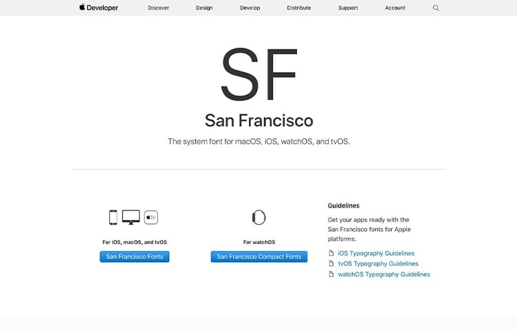
Apple's system font has been changed from the previous Helvetica Neue to San Francisco. This font was first adopted on the Apple Watch, presumably because Apple wanted a font that remains readable even on small screens like a watch.
It's now used on devices other than Apple Watch as well, but the catalyst was likely mobile-first thinking. The importance of UI for smartphone users is expected to continue growing.
Conclusion
This time, we introduced the web design and UI trends getting attention in 2017.
Going forward, with the evolution of VR and other technologies, UI that approaches reality and appeals to the five senses will likely become more mainstream.
We'll continue paying attention to the trends happening in the world of web design each day.
*Please note that some of the source sites referenced are seasonal campaign sites, which may be taken down after a certain period.
Reference: 5 Web Design Trends to Incorporate in the First Half of 2017
Reference: Stimulate the Senses! 10 Web Design Ideas to Watch in 2017
Reference: Get a Head Start on 2017! Latest Web Design Trends Summary
Reference: The Future is Now: 10 Design Predictions for 2017
Reference: Web Design Trends for 2017
Reference: Web Design Trends for 2017
RECENT POSTS

Vol.203
What Is Design Management

Vol.202
Why Hiring No Longer Works— Redesigning Organizations and Decisions for an Uncertain Age

Vol.201
How to Choose a Branding Agency: 5 Criteria to Avoid Failure

Vol.200
Design Management: A Practical Guide for SMEs and Startups to Drive Real Results

Vol.199
How to Rebuild Brand Competitiveness: A Practical Guide to Brand Management for SMEs

Vol.198
From parent–child bonds to community: The future of education that nurtures diversity and designs relationships


