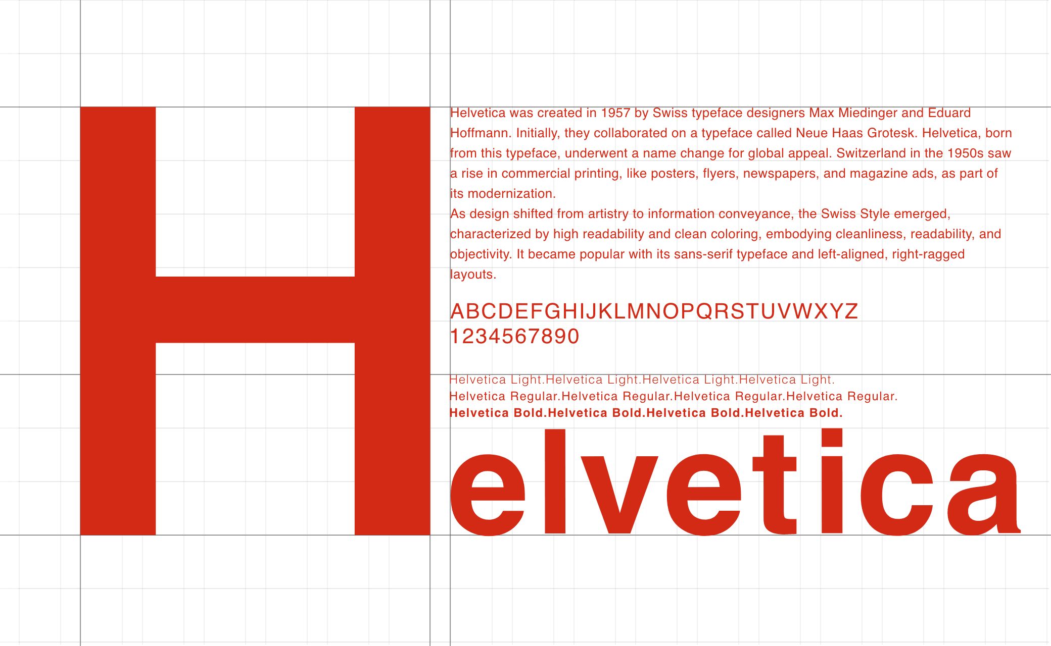
DESIGN
Vol.97

Y.T.
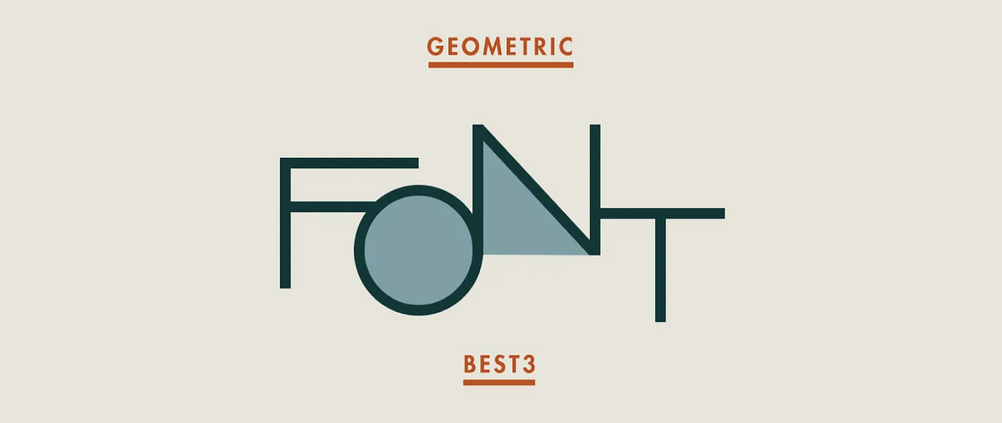
2019年 幾何学フォントTOP3
Gordita ゴルディータ
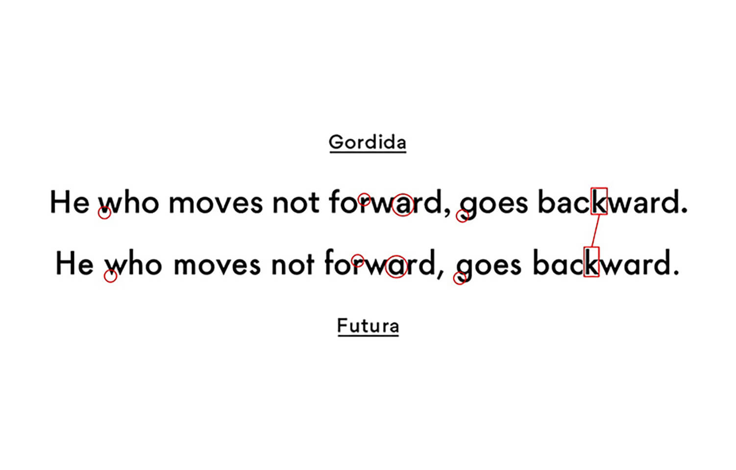
オーストラリア出身のデザイナーThomas Gillettによる書体です。 FuturaとGothamの影響を受けていると言えるでしょう。 gothamよりもシャープに、futuraよりもナチュラルで優しい印象です。 開口部が小さいインクトラップは、優れた読みやすさをサポート。 かつ、futuraのように幾何学的に見えるように光学的に補正をしています。 Gorditaは7つのウェイトがあり、さまざまな使い道があります。
GT Walsheim ヴァルスハイム

GT Walsheimは、スイスのフォントメーカーGrilli typeから発売された書体です。 スイスのデザイナーOtto Baumbergerのポスターの文字から着想を得ています。

引用:Otto Baumberger http://luc.devroye.org/fonts-59704.html
大きな特徴は大文字のGになるでしょう。安定感と特徴の強いGT Walsheimは、多くのデザイナーを魅了しています。
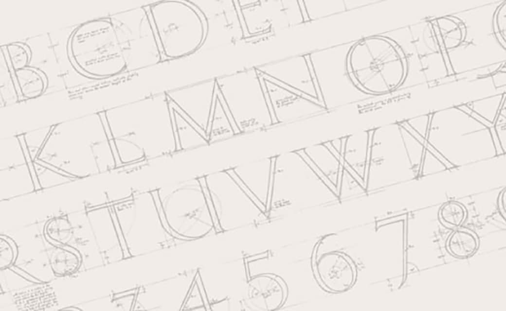
Futura フーツラ
幾何学的なフォントの起源とも言えるfuturaは、 ドイツの活字デザイナーPaul Rennerによってデザインされました。
1920年代にできて、今なお可読性の高いフォントとして愛されています。
映画監督のウェス・アンダーソンも好んでおり、 彼の映画ではfutura書体が多く取り入られています。

Futuraのバリエーションは数多くあり、 デザイナーは好みに合わせて使用することができます。
まとめ
いかがでしたでしょうか。
他にもたくさんの幾何学書体が出ています。 今回はこちらの3つに絞らせてもらいました。
新たな書体の出会いになってもらえたら幸いです。
RECENT POSTS

Vol.198
From parent–child bonds to community: The future of education that nurtures diversity and designs relationships

Vol.197
Exploring the future of environmental design integrating vision, diversity, and a future-oriented perspective

Vol.196
Vision-making for diverse and future-oriented education: Interpreting the future of learning through environmental design

Vol.195
“One Health” and Japan — Toward an Era of Integrating Humans, Animals, and the Environment

Vol.194
The benefits and challenges of digital education in the AI era, and the future of learning

Vol.193
Vision-Making in the age of AI — How artificial intelligence is transforming the meaning of work and the nature of organizations