A region's uniqueness becomes the core of a brand.
What Hakodate Airport Building Inc. set out to do was not to revamp a souvenir shop, but to redefine the identity of Hakodate as a city. The process of discovering the region's unique cultural resources, articulating them, and placing them at the core of a new business concept is both the essence of regional branding and synonymous with "vision design" in any new venture.
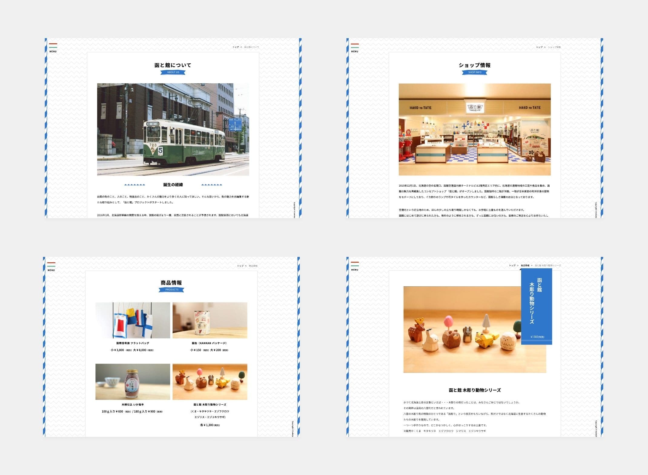
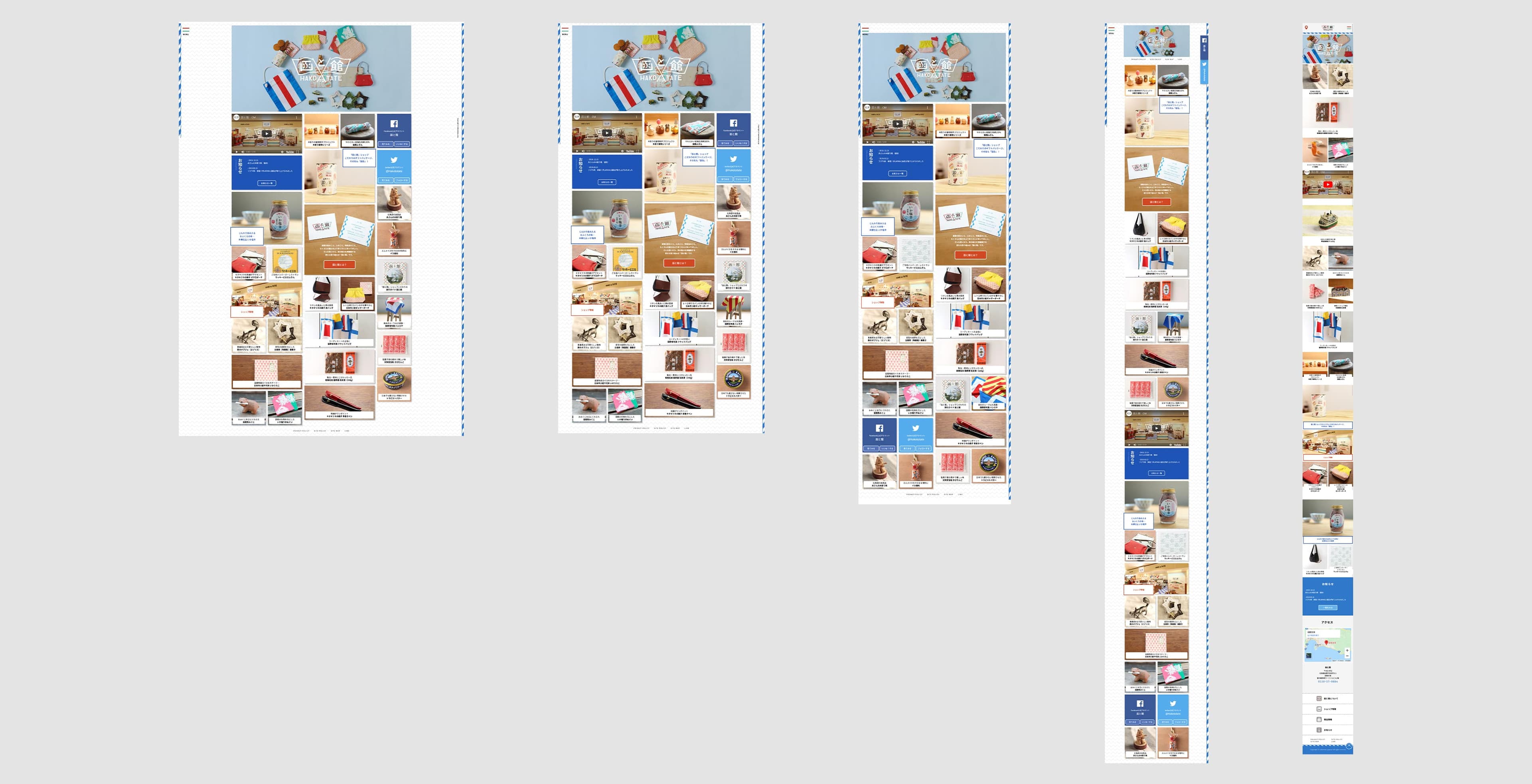
HAKO to TATE is a practical model of regional branding, recognized with the 2016 Good Design Award.
Context
Regional Airport Management Challenges Gave Rise to a Question About Local Branding
At the time, many regional airports across Japan were entering a major period of transition. Structural challenges — including aircraft size limitations, an oversupply of government-built airports, and rigid administration-led management — had made fundamental reform a necessity, with inbound strategies becoming a key focus for sustainable operations.
Hakodate Airport was part of that context. Against a backdrop of stagnating passenger numbers and a sluggish regional economy, the question Hakodate Airport Building Inc. chose to confront was: how do you create a compelling reason to visit Hakodate? The insight was to use the everyday touchpoint of souvenirs as a starting point for reexamining the value of Hakodate as a city. That shift in thinking became the foundation of this project.
Approach
A Web Branding that Collects the Charms of Hakodate
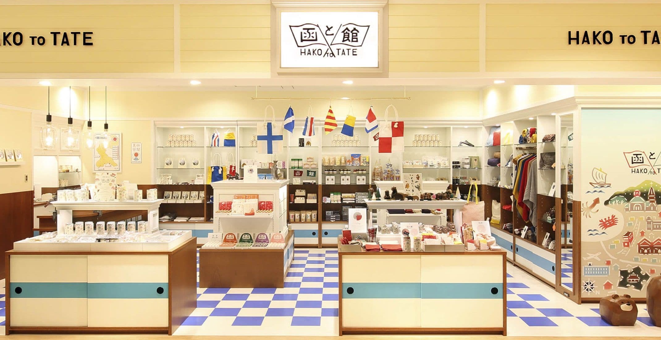
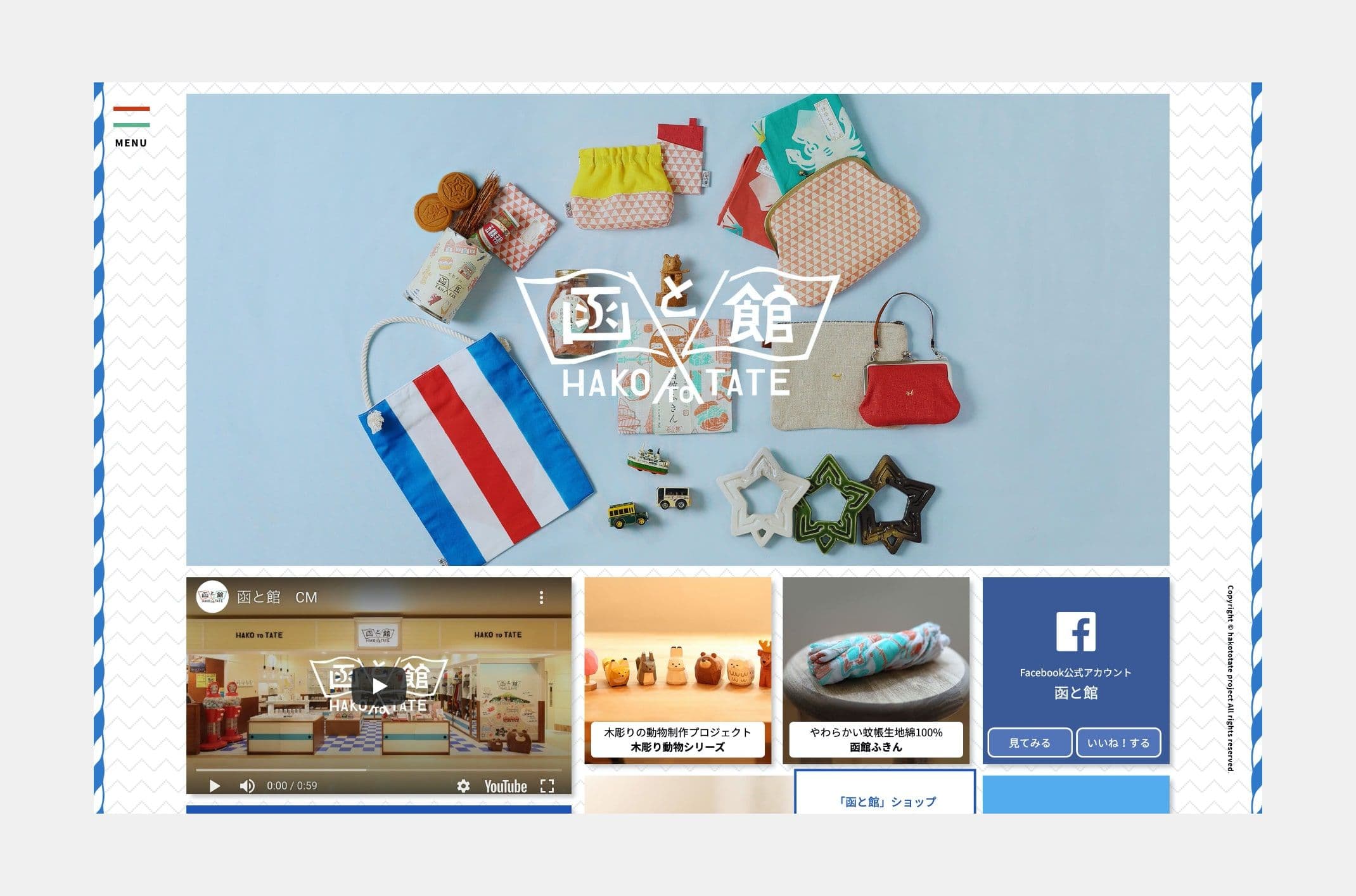
During field research, a structural discovery emerged: Hakodate's culture is built, with remarkable consistency, on the concept of "pairs." Night views split into "front" and "back." The cloisters divide into the male Trappist monastery and the female Trappistine convent. Even the city's name was found to pair "Hako" (steep cliff) with "Tate" (high hill).
Rather than treating this as a tourism factoid, placing it at the core of the business concept — as the defining vision for what Hakodate stands for — was the decision that set the direction for the entire project. The concept shop inside Hakodate Airport was implemented as a physical space where visitors could experience that identity firsthand. We led the full brand architecture, from articulating the vision through to visual identity and web experience design.
Outcome
Redesigning Regional Resources Generated a New Brand Experience
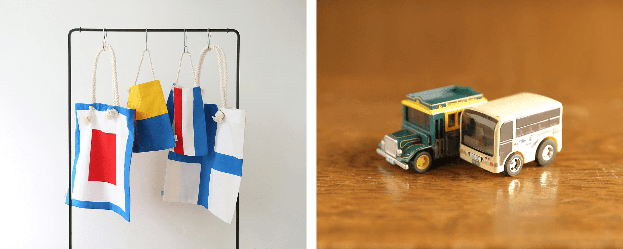
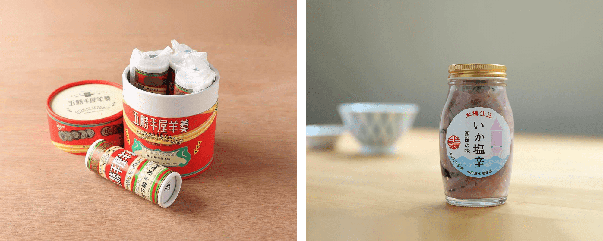
The experiential value of "something only found at Hakodate Airport" did not emerge from product differentiation — it was the outcome of vision design. Original products co-developed with local manufacturers became touchpoints where visitors could physically experience Hakodate's identity, connecting travelers and regional industries through a new context.
The project received the 2016 Good Design Award, recognized as a practical model of regional branding that discovers and articulates a region's unique cultural resources, places them at the core of a business concept, and integrates tourism, local industry, and brand into a unified whole.
Type
faces
Color
Schemes
RGB / 68 119 196
CMYK / 80 50 0 0
HEX #4477C4
RGB / 207 58 21
CMYK / 24 90 100 0
HEX #CF3A15
RGB / 90 178 140
CMYK / 66 12 55 0
HEX #5AB28C


NEXT
CIP