
Rebuilding “A Place Where People Challenge, Learn, and Transform” as a Brand
A corporate branding project that redefined WiLLSeed’s identity as an organization that nurtures human will and initiative through experience, while carrying forward the philosophy inherited from its founder.
WiLLSeed is an education and human development company focused on helping people challenge themselves and grow through corporate training, global talent development, and educational programs for younger generations.
BOEL led the overall redesign of the corporate brand for this project.
At the time, WiLLSeed had already established recognition as a training company. However, the breadth of its philosophy and activities was not being fully communicated.
In addition to corporate training, the company was involved in collaborations with educational institutions, workshops with local governments, youth education programs, and global talent development initiatives. Despite this, it was often perceived simply as a “corporate training company.”
The organization was also going through a major transition period, including the departure of its founder and participation in a larger corporate group.
Amid these changes, there was a growing need to redefine and clarify what WiLLSeed truly represented.
Through extensive dialogue with employees, what became clear was the strong passion for believing in people’s potential that had been carried on since the company’s founding.
Under the philosophy of “One experience is worth more than a hundred words,” WiLLSeed believed that people develop willpower and initiative by thinking, challenging themselves, and learning through real experiences. This philosophy was deeply embedded throughout the company’s educational programs.
BOEL recognized that this idea — nurturing human will through experience — was the true core of the WiLLSeed brand.
The project began with the goal of redefining WiLLSeed not simply as a training company, but as an organization that creates places where people challenge themselves, learn, and transform.
Context
Being Seen Only as a “Training Company” Was No Longer Enough
Although WiLLSeed operated a wide range of educational and talent development programs, the philosophy and broader meaning behind these activities were not being clearly communicated.
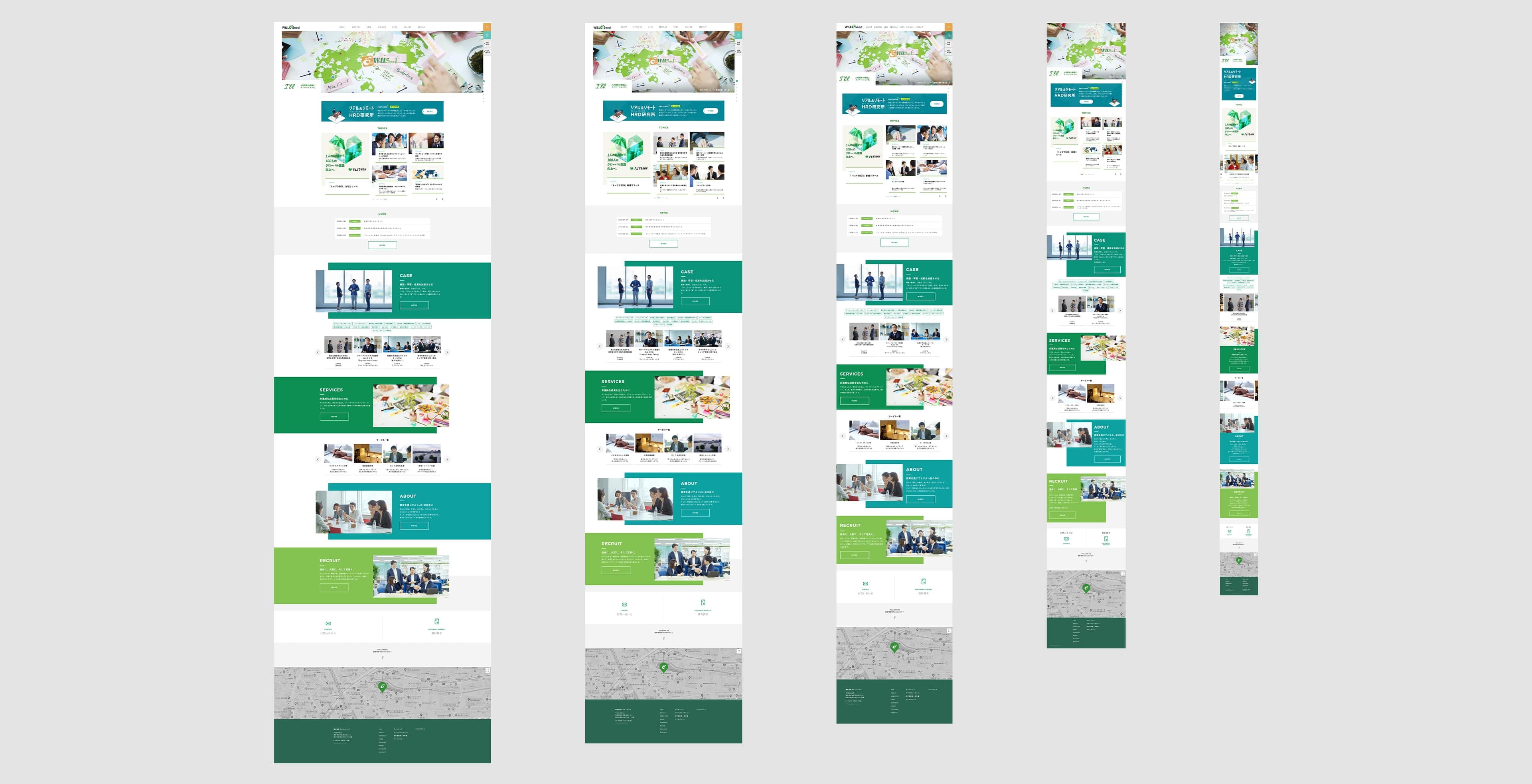
Its website mainly functioned as a place to introduce training services, and failed to fully express WiLLSeed’s deeper approach toward education and human growth.
At the time, websites were not yet considered a major branding platform as they are today. Corporate websites were generally treated simply as places to display company information.
However, what WiLLSeed truly needed to communicate was not a list of services.
It needed to express:
* Why it continued supporting people’s growth and challenges
* Why it valued “experience” so deeply
* Why it sought to nurture people’s will and initiative
What needed to be communicated was the philosophy behind the organization itself.
In particular, the company needed to show how the founder’s philosophy would be carried into the next generation.
At the same time, the employees themselves were deeply committed to education and human development.
Through repeated discussions, it became clear that strong beliefs such as “people change through experience” and “people move forward when given opportunities and inspiration” were deeply rooted throughout the organization.
What was required was not simply a visual redesign.
The real challenge was to articulate WiLLSeed’s educational philosophy and passion, and communicate why the organization exists in the first place.
The project also needed to function internally as a form of internal branding, helping employees rediscover and reaffirm their own identity as part of the organization.
Approach
Designing Not “Educational Services,” but “Experiences That Transform People”
BOEL redefined WiLLSeed as an organization that creates places where people challenge themselves, learn, and grow.
The goal was not simply to reorganize service offerings.
It was to translate the educational philosophy embedded within the organization into a coherent brand.
Through extensive discussions with core team members, BOEL organized and clarified WiLLSeed’s values and culture.
What emerged was a clear belief:
People transform through their own experiences.
The name “WiLLSeed” itself embodies the idea of planting seeds of awareness, inspiration, and willpower that eventually spread outward into society.
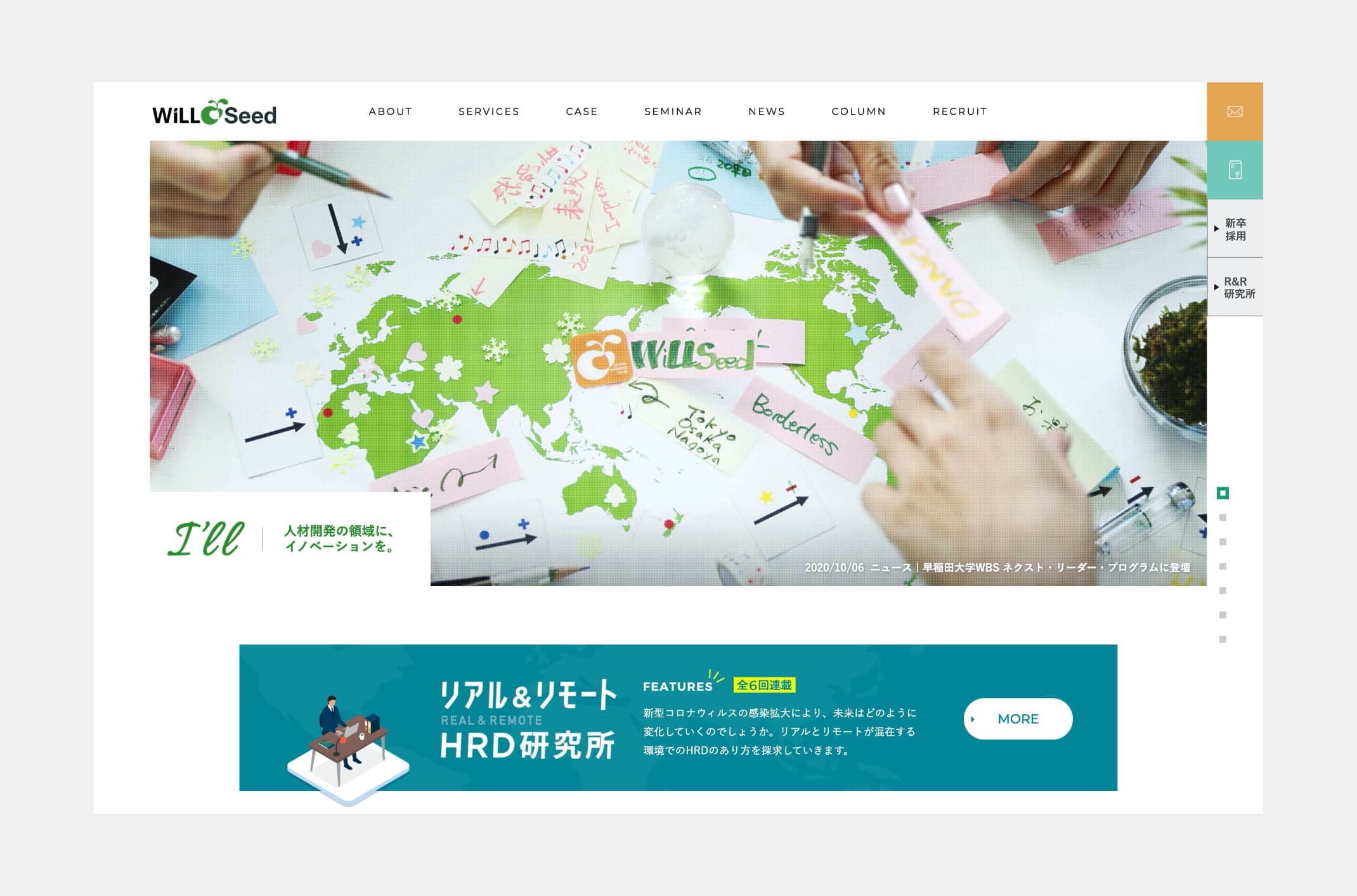
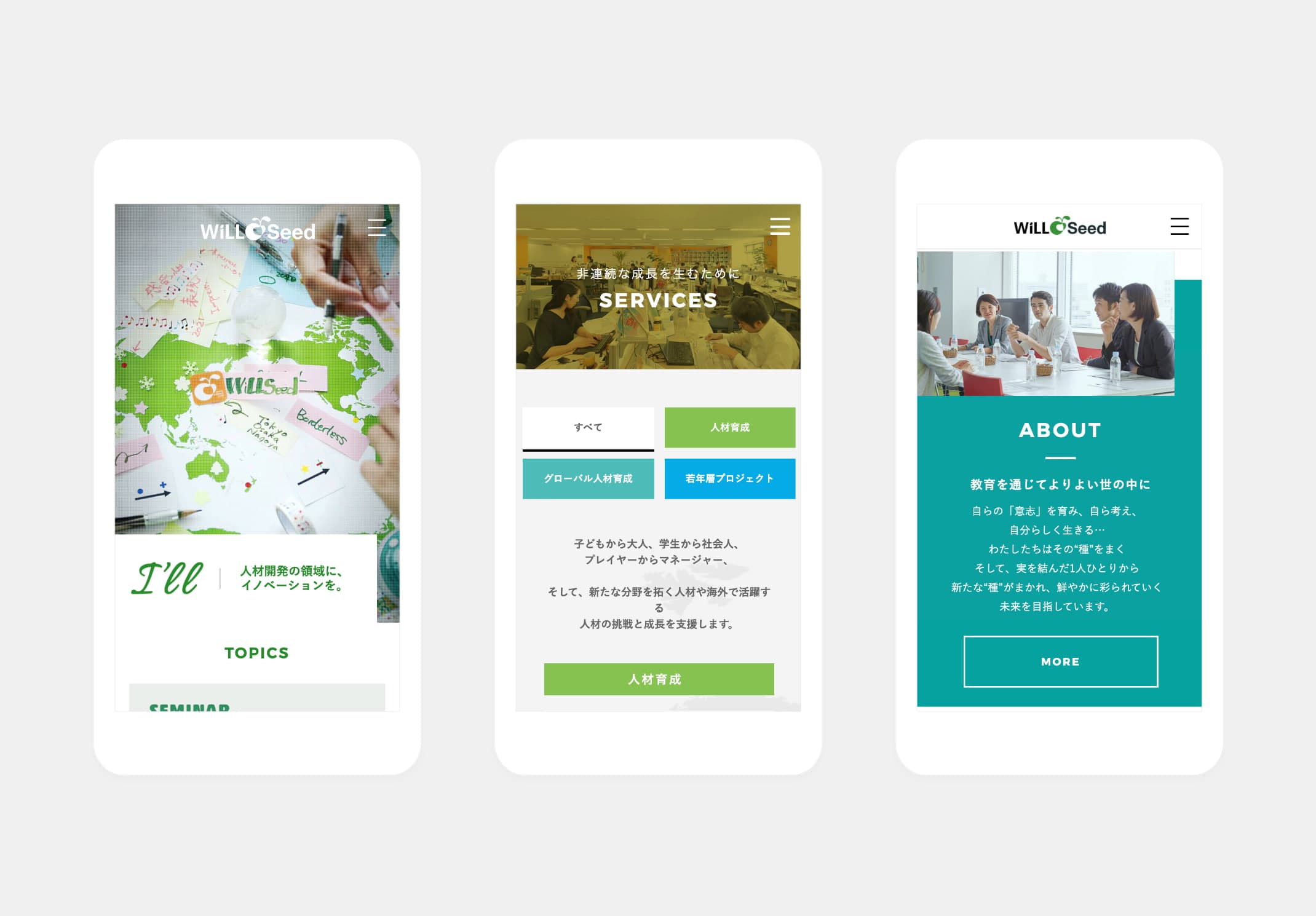
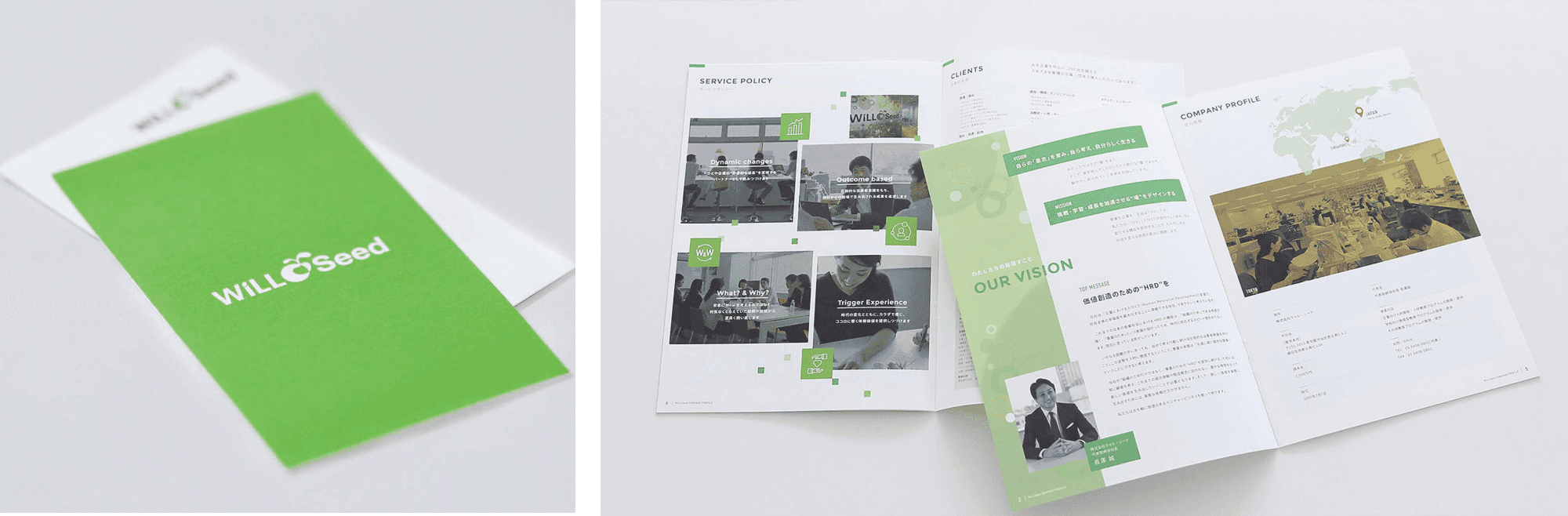
Based on this philosophy, BOEL redesigned the company’s entire brand communication system, including:
* Visual Identity (VI)
* Copywriting
* Website design
* Corporate brochures and tools
Rather than positioning WiLLSeed as a polished or purely “smart” education company, the branding emphasized the organization’s passion, sincerity, and deep commitment to people.
BOEL also reorganized the company’s diverse educational activities and social initiatives into a unified narrative, making WiLLSeed’s broader role in shaping learning and transformation across society more visible.
This branding effort was not only external communication.
It also became a process through which employees themselves could reconnect with the meaning and purpose of the organization.
BOEL sees branding not as “making things look better,” but as translating an organization’s philosophy into a form society can understand.
The WiLLSeed project became a symbolic example of this approach.
Outcome
From a “Training Company” to a “Brand That Creates Spaces for Human Transformation”
Through these efforts, WiLLSeed evolved beyond the image of a conventional training company and established a new brand identity as an organization that creates environments where people can challenge themselves, learn, and transform.
The renewed website and corporate tools gradually changed how both internal and external stakeholders perceived the company.
In particular, the project clarified WiLLSeed’s educational philosophy and wide-ranging activities, making the company’s unique identity much more visible.
The project also increased internal awareness of brand communication and strengthened interest in how the organization presented itself to society.
This was not simply a corporate website renewal project.
It was an effort to articulate the organization’s philosophy and passion, and redefine how it presents its identity to society.
At the same time, the process strengthened internal branding by helping employees rediscover and reconnect with the meaning of the brand themselves.
Ultimately, the project became an initiative that reconsidered what education truly means and what it means to support human growth — redefining “a place where people continuously transform” as the organization’s very reason for existence.
It also demonstrated a new model of corporate branding: one that does not rely solely on the charisma of a founder, but instead enables the organization itself to inherit, evolve, and carry forward its philosophy over time.
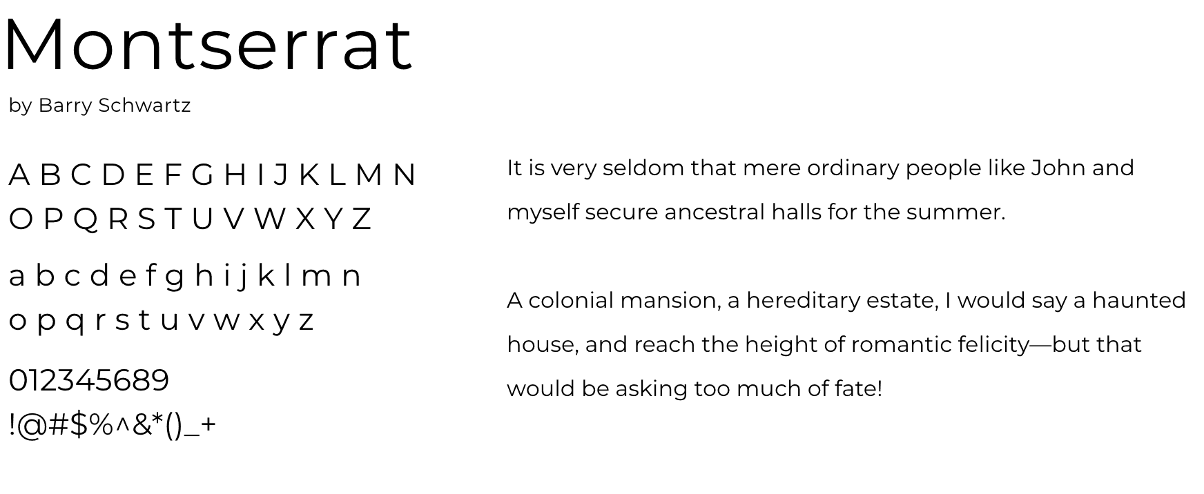
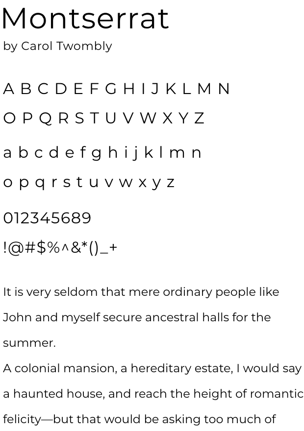
Type
faces
Color
Schemes
RGB / 255 255 255
CMYK / 0 0 0 0
HEX #ffffff
RGB / 237 237 237
CMYK / 8 7 7 0
HEX #EDEDED
RGB / 43 102 82
CMYK / 84 52 74 13
HEX #2B6652


NEXT
KAWATA CONSTRUCTION